Hands-on: Differential expression analysis
Once we have the gene counts, we can perform differential expression analysis. The goal of differential expression analysis is to perform statistical analysis to try and discover changes in expression levels of defined features (genes, transcripts, exons) between experimental groups with replicated samples.
Flowchart with the steps in RNAseq differential expression analysis.
Read quantification
 ┌───────────────────────────────┐
 │ STAR alignment → gene counts  │
 │        or                     │
 │ Salmon → transcript counts    │
 └───────────────────────────────┘
            │
            │
            ▼
    Import counts into R
    (counts + sample metadata)
            │
            │
            ▼
    Create DESeq2 dataset
    DESeqDataSetFromMatrix()
    or
    tximport (for Salmon)
            │
            │
            ▼
    Filtering
    (remove very low count genes)
            │
            │
            ▼
    Normalization
    (size factor estimation)
            │
            │
            ▼
    Exploratory analysis
    VST / rlog transformation
    PCA / sample correlation
    (outlier detection)
            │
            │
            ▼
    Differential expression model
    Run DESeq()
    • dispersion estimation
    • GLM fitting
    • statistical testing
            │
            │
            ▼
    Results extraction
    results()
    (log2FoldChange, p-value, padj)
            │
            │
            ▼
    Identify DE genes
    (padj < 0.05, |log2FC| threshold)
            │
            │
            ▼
    Downstream analysis
    • heatmaps
    • volcano plots
    • pathway enrichment
    • GO analysis
Popular tools
Most of the popular tools for differential expression analysis are available as R / Bioconductor packages. Bioconductor is an R project and repository that provides a set of packages and methods for omics data analysis.
The best performing tools for differential expression analysis tend to be:
Aspect |
DESeq2 |
edgeR |
limma-voom |
|---|---|---|---|
Core statistical model |
Negative Binomial GLM |
Negative Binomial GLM |
Linear model after voom transformation |
Key statistical idea |
Empirical Bayes shrinkage of dispersion and fold change |
Empirical Bayes shrinkage of dispersion |
Mean-variance modeling with precision weights |
Data type used directly |
Raw count data |
Raw count data |
Counts transformed to log-CPM via voom |
Variance modeling |
Dispersion estimated and shrunk toward trend |
Dispersion estimated (common, trended, tagwise) |
Variance estimated from mean-variance relationship |
Normalization method |
Median-of-ratios size factors |
TMM normalization |
Usually TMM (edgeR) before voom |
Statistical test |
Wald test (default) or LRT |
Exact test, GLM likelihood ratio, quasi-likelihood |
Moderated t-tests |
Handling small sample sizes |
Good |
Excellent |
Moderate |
Handling large datasets |
Good |
Good |
Excellent |
Speed / computational cost |
Moderate |
Fast |
Very fast |
Ease of use |
Very beginner-friendly |
Intermediate |
Intermediate |
Flexibility for complex designs |
Good |
Very good |
Excellent |
Low-count genes |
Conservative handling |
Handles low counts well |
Less ideal for extremely low counts |
Further reading
For more information see Schurch et al, 2015; arXiv:1505.02017 and the Biostars thread about the main differences between the methods.
Main differences between the tools rely on the statistical modeling of counts and different normalization approaches. They capture different biological meaning and their results are not mutually exclusive.
In this tutorial, we will give you an overview of the DESeq2 pipeline to find differentially expressed genes between two conditions.
DESeq2
This DESeq2 tutorial is inspired by the RNA-seq workflow developed by the authors of the tool, and by the differential gene expression course from the Harvard Chan Bioinformatics Core.
DESeq2 is an R/Bioconductor implemented method to detect differentially expressed features.
It tests for differential expression using negative binomial generalized linear models.
|
Source: https://bioramble.wordpress.com/2016/01/30/why-sequencing-data-is-modeled-as-negative-binomial/ |
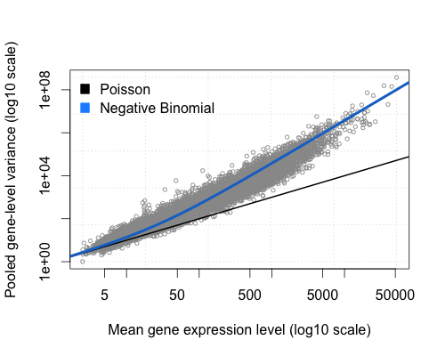
DESeq2 (as edgeR) is based on the hypothesis that most genes are not differentially expressed.
DESeq2 takes as an input raw counts (i.e. non normalized counts): the DESeq2 model internally corrects for library size, so giving as an input normalized count would be incorrect.
DESeq2 steps
Modeling raw counts for each gene:
Estimate size factors (accounts for differences in library size): estimateSizeFactors()
Estimate dispersions: estimateDispersions()
GLM (Generalized Linear Model) fit for each gene: nbinomWaldTest()
Testing for differential expression (Wald test).
DESeq2 uses the median of ratio method for normalization: briefly, the raw counts are divided by sample-specific size factors.
Let’s see how it works with a simple example:
Raw counts:
Gene |
Sample A |
Sample B |
Sample C |
|---|---|---|---|
GeneA |
80 |
160 |
95 |
GeneB |
1200 |
2100 |
1350 |
GeneC |
340 |
700 |
410 |
GeneD |
55 |
980 |
60 |
GeneE |
430 |
820 |
500 |
For each gene, the geometric mean is calculated across all samples:
Gene |
Geometric mean |
|---|---|
GeneA |
(80 × 160 × 95)^(1/3) = 1,216,000^(1/3) ≈ 106.6 |
GeneB |
(1200 × 2100 × 1350)^(1/3) = 3,402,000,000^(1/3) ≈ 1503.3 |
GeneC |
(340 × 700 × 410)^(1/3) = 97,580,000^(1/3) ≈ 461.5 |
GeneD |
(55 × 980 × 60)^(1/3) = 3,234,000^(1/3) ≈ 147.9 |
GeneE |
(430 × 820 × 500)^(1/3) = 176,300,000^(1/3) ≈ 560.7 |
Note
We use the geometric mean instead of the arithmetic mean because it is less sensitive to outliers (very high or very low count values).
Then the counts for a gene in each sample is then divided by this mean.
Gene (geo mean) |
Sample A |
Sample B |
Sample C |
|---|---|---|---|
GeneA (106.6) |
80 ÷ 106.6 = 0.75 |
160 ÷ 106.6 = 1.50 |
95 ÷ 106.6 = 0.89 |
GeneB (1503.3) |
1200 ÷ 1503.3 = 0.80 |
2100 ÷ 1503.3 = 1.40 |
1350 ÷ 1503.3 = 0.90 |
GeneC (461.5) |
340 ÷ 461.5 = 0.74 |
700 ÷ 461.5 = 1.52 |
410 ÷ 461.5 = 0.89 |
GeneD (147.9) |
55 ÷ 147.9 = 0.37 |
980 ÷ 147.9 = 6.63 |
60 ÷ 147.9 = 0.41 |
GeneE (560.7) |
430 ÷ 560.7 = 0.77 |
820 ÷ 560.7 = 1.46 |
500 ÷ 560.7 = 0.89 |
The median of these ratios in a sample is the size factor for that sample.
Gene |
Sample A ratios |
Sample B ratios |
Sample C ratios |
|---|---|---|---|
GeneA |
0.75 |
1.50 |
0.89 |
GeneB |
0.80 |
1.40 |
0.90 |
GeneC |
0.74 |
1.52 |
0.89 |
GeneD |
0.37 |
6.63 |
0.41 |
GeneE |
0.77 |
1.46 |
0.89 |
Sorted → median |
0.37, 0.74, 0.75, 0.77, 0.80 |
1.40, 1.46, 1.50, 1.52, 6.63 |
0.41, 0.89, 0.89, 0.89, 0.90 |
Size factor |
0.75 |
1.50 |
0.89 |
Each raw count is divided by the size factor of the sample it belongs to.
Gene |
Sample A (÷ 0.75) |
Sample B (÷ 1.50) |
Sample C (÷ 0.89) |
|---|---|---|---|
GeneA |
107 |
107 |
107 |
GeneB |
1600 |
1400 |
1517 |
GeneC |
453 |
467 |
461 |
GeneD |
73 |
653 |
67 |
GeneE |
573 |
547 |
562 |
See also
You can also find normalized counts by using the TPM (Transcripts Per Million) or FPKM (Fragments Per Kilobase of transcript per Million mapped reads) metrics. See here
Tutorial on basic DESeq2 usage for differential analysis of gene expression
In this tutorial, we will use the counts calculated from the mapping on all chromosomes (we practiced so far QC and mapping for data of only one chromosome but here we consider all chromosomes), for the 10 samples previously selected from GEO:
GEO ID |
SRA ID |
Sample name |
Differentiation |
Condition |
|---|---|---|---|---|
GSM2031982 |
SRR3091420 |
5p4_25c |
undiff |
WT |
GSM2031983 |
SRR3091421 |
5p4_27c |
undiff |
WT |
GSM2031984 |
SRR3091422 |
5p4_28c |
diff 5 days |
WT |
GSM2031985 |
SRR3091423 |
5p4_29c |
diff 5 days |
WT |
GSM2031986 |
SRR3091424 |
5p4_30c |
diff 5 days |
WT |
GSM2031987 |
SRR3091425 |
5p4_31cfoxc1 |
undiff |
KO |
GSM2031988 |
SRR3091426 |
5p4_32cfoxc1 |
undiff |
KO |
GSM2031989 |
SRR3091427 |
5p4_33cfoxc1 |
undiff |
KO |
GSM2031990 |
SRR3091428 |
5p4_34cfoxc1 |
diff 5 days |
KO |
GSM2031991 |
SRR3091429 |
5p4_35cfoxc1 |
diff 5 days |
KO |
The FOXC1 protein plays a critical role in early development, particularly in the formation of structures in the front part of the eye (the anterior segment). These structures include the colored part of the eye (the iris), the lens of the eye, and the clear front covering of the eye (the cornea). Studies suggest that the FOXC1 protein may also have functions in the adult eye, such as helping cells respond to oxidative stress. Oxidative stress occurs when unstable molecules called free radicals accumulate to levels that can damage or kill cells. The FOXC1 protein is also involved in the normal development of other parts of the body, including the heart, kidneys, and brain. Source.
Get the count data for the full data set, output of both STAR and Salmon:
# Navigate to your course directory
mkdir -p ~/rnaseq_course/differential_expression
cd ~/rnaseq_course/differential_expression

# Download the full count data folder from the course repository
wget https://biocorecrg.github.io/RNAseq_coursesCRG_2026/latest/data/differential_expression/full_data_counts.tar.gz

# Untar the data -x extract folder -z gzip decompression -v verbose -f file
tar -xzvf full_data_counts.tar.gz
rm full_data_counts.tar.gz
Raw count matrices
DESeq2 takes as an input raw (non normalized) counts, in various forms:
A matrix for all sample, very typical in microarrays: DESeqDataSetFromMatrix()
One file per sample (our option for STAR): DESeqDataSetFromMatrix()
A txi object (our option for Salmon): DESeqDataSetFromTximport()
Prepare data from STAR
We need to create one file per sample, each file containing the raw counts of all genes:
File SRR3091420_1_chr6_counts.txt:
gene_id |
count |
|---|---|
ENSG00000260370.1 |
0 |
ENSG00000237297.1 |
10 |
ENSG00000261456.5 |
210 |
File SRR3091421_1_chr6_counts.txt:
gene_id |
count |
|---|---|
ENSG00000260370.1 |
0 |
ENSG00000237297.1 |
8 |
ENSG00000261456.5 |
320 |
and so on…
Remember that the STAR count file contains 4 columns depending on the library preparation protocol!
Exercise
Prepare the 10 files needed for our analysis, from the STAR output, and save them in the counts_selected directory: knowing that our libraries are unstranded, which column will you pick?
Create the sub-directory counts_STAR_selected inside the deseq2 directory:
cd ~/rnaseq_course/differential_expression
mkdir counts_STAR_selected
Loop around the 10 ReadsPerGene.out.tab files and extract the gene ID (1st column) and the correct counts (2nd column).
for i in full_data_counts/counts_STAR/*ReadsPerGene.out.tab
do echo $i
# retrieve the first (gene name) and second column (raw reads for unstranded protocol)
cut -f1,2 $i | grep -v "_" > counts_STAR_selected/$(basename $i .ReadsPerGene.out.tab)_counts.txt
done
Sample sheet
Additionally, DESeq2 needs a sample sheet that describes the samples characteristics: treatment, knock-out / wild type, replicates, time points, etc. in the form:
SampleName |
FileName |
Differentiation |
Condition |
|---|---|---|---|
5p4_25c |
SRR3091420_counts.txt |
undiff |
WT |
5p4_27c |
SRR3091421_counts.txt |
undiff |
WT |
5p4_28c |
SRR3091422_counts.txt |
diff5days |
WT |
5p4_29c |
SRR3091423_counts.txt |
diff5days |
WT |
5p4_30c |
SRR3091424_counts.txt |
diff5days |
WT |
5p4_31cfoxc1 |
SRR3091425_counts.txt |
undiff |
KO |
5p4_32cfoxc1 |
SRR3091426_counts.txt |
undiff |
KO |
5p4_33cfoxc1 |
SRR3091427_counts.txt |
undiff |
KO |
5p4_34cfoxc1 |
SRR3091428_counts.txt |
diff5days |
KO |
5p4_35cfoxc1 |
SRR3091429_counts.txt |
diff5days |
KO |
The first column is the sample name, the second column the file name of the count file generated by STAR (after selection of the appropriate column as we just did), and the remaining columns are description of the samples, some of which will be used in the statistical design.
The design indicates how to model the samples: in the model we need to specify what we want to measure and what we want to control.
Exercise
Prepare this file (tab-separated columns) in a text editor: save it as sample_sheet_foxc1.txt in the differential_analysis directory: you can do it “manually” using a text editor, or you can try using the command line.
Note
The same sample sheet will be used for both the STAR and the Salmon DESeq2 analysis. (with a slight modification that we will see later on)
BACK UP
You can download it the following way, in R:
wget https://biocorecrg.github.io/RNAseq_coursesCRG_2026/latest/data/differential_expression/sample_sheet_foxc1.txt
Analysis
The analysis is done in R!
We will use a local RStudio server running a Singularity container as we did in R introduction section.
From RStudio, open a new R script file.
Note that in the R code boxes below # is followed by comments, i.e. words not interpreted by R, as in Linux.
Go to the differential_expression working directory and install and load the required packages (loading a package in R allows to use specific sets of functions developed as part of this package).
The main libraries we will use are belong to the Bioconductor project, a repository of R packages for the analysis of omics data.
library(BiocManager)  ## Library to install and manage packages from Bioconductor.

BiocManager::install("DESeq2") ## Installation of the package for differential expression analysis, only needed the first time in RStudio local installation.
library("DESeq2") ## Loading the package.

BiocManager::install("EnhancedVolcano")
BiocManager::install("tximport")
BiocManager::install("biomaRt")
BiocManager::install("pheatmap")
install.packages("reshape2")

# setwd = set working directory; equivalent to the Linux "cd". All the files you will write will be in this directory
# the R equivalent to the Linux pwd is getwd() = get working directory
# unless you change or specify another address, all the written files will be in this directory.
setwd("~/rnaseq_course/differential_expression")
Import STAR counts
Read in the sample table that we prepared:
# read in the sample sheet
# header = TRUE: the first row is the "header", i.e. it contains the column names
# sep = "\t": the columns/fields are separated with tabs
sampletable <- read.table("sample_sheet_foxc1.txt", header=T, sep="\t")

# add the SRA codes as row names (it is needed for some of the DESeq functions)
rownames(sampletable) <- gsub("_counts.txt", "", sampletable$FileName)

# display the first 6 rows
head(sampletable)

# check the number of rows and the number of columns
nrow(sampletable) # if this is not 10, please raise your hand !
ncol(sampletable) # if this is not 4, also raise your hand !
Warning
DESeq will process only the counts for the files listed in the sample table (keep in mind for future exercises and when you want to exclude some samples from the analysis).
Load the count data from STAR into a DESeq object:
sampleTable: the sample sheet / metadata we created
directory: path to the directory where the counts are stored (one file per sample)
design: design formula describing which variables will be used to model the data. Here we want to compare the experimental groups in “Condition”.
# Import STAR counts
se_star <- DESeqDataSetFromHTSeqCount(sampleTable = sampletable,
                        directory = "counts_STAR_selected",
                        design = ~ Condition)
Design formula
The design formula is used to estimate the dispersions and to estimate the log2 fold changes of the model! For more information on how to build a design formula, see here.
We will focus the rest of the analysis on the se_star.
Filtering out lowly expressed genes
From DESeq2 vignette: While it is not necessary to pre-filter low count genes before running the DESeq2 functions, there are two reasons which make pre-filtering useful: by removing rows in which there are very few reads, we reduce the memory size of the dds data object, and we increase the speed of the transformation and testing functions within DESeq2.
Let’s filter:
# Number of genes before filtering
nrow(se_star)

# Filter, we keep only the genes that have at least 10 counts in total (across all samples)
se_star <- se_star[rowSums(counts(se_star)) > 10, ]

# Number of genes left after low-count filtering
nrow(se_star)
Prepare annotation
The biomaRt package is used for adding a more detailed annotation to our data sets.
Tip
When we don’t perform the mapping, this tool is very useful when we receive directly the counts matrix and we lack the annotation file information.
Additionally to the ENSEMBL gene IDs we want (for example):
The external gene name (symbol)
A more thorough gene description
Chromosome and coordinates
# load library
library(biomaRt)

# list ENSEMBL archives
listEnsemblArchives()

# We used release 115 of ENSEMBL, which corresponds to URL <https://sep2025.archive.ensembl.org>
# we can load the corresponding database
mart <- useMart(
  biomart="ENSEMBL_MART_ENSEMBL",               # database name
  host="https://sep2025.archive.ensembl.org", # URL
  path="/biomart/martservice",                  # path after the host to get access to the web service URL
  dataset="hsapiens_gene_ensembl")              # specie dataset (human in this case)

# "filters" correspond to the input we want to retrieve more annotation for
# a list of available filters can be obtained with listFilters(mart)
head(listFilters(mart))

# let's see what is available in terms of ensembl ID
grep("ensembl", listFilters(mart)[,1], value=TRUE)

# ensembl_gene_id is what we want
# "attributes" correspond to the kind of annotation you want to retrieve
# a list of available attributes can be obtained with listAttributes(mart)

head(listAttributes(mart))

# you can browse and decide what is interesting for you. For this exercise, we will use 'ensembl_gene_id', 'chromosome_name', 'start_position', 'end_position', 'description', 'external_gene_name'

# list of ENSEMBL IDs we want to annotate
gene_ids <- rownames(se_star)
# 18084 IDs

# annotate
annot <- getBM(attributes=c('ensembl_gene_id', 'chromosome_name', 'start_position', 'end_position', 'description', 'external_gene_name'), filters ='ensembl_gene_id', values = gene_ids, mart = mart)
dim(annot)
# 18084 rows

head(annot)
See also
For more information on how to use biomaRt, see here
Fit statistical model
All steps are wrapped up in a single call to DESeq(), which runs three phases: normalization, dispersion estimation, and statistical testing.
se_star2 <- DESeq(se_star)
Estimating size factors: corrects for differences in sequencing depth between samples using the median-of-ratios method. Each sample gets a size factor; dividing its raw counts by that factor normalizes it (as wee see in the previously)
Gene-wise dispersion estimates: RNA-seq counts are overdispersed (variance > mean). DESeq2 uses a Negative Binomial model with a gene-specific dispersion parameter (α), estimated independently for each gene via maximum likelihood.
Mean-dispersion relationship: lowly expressed genes tend to be more variable. DESeq2 fits a smooth trend curve of dispersion vs. mean expression across all genes.
Final dispersion estimates: combines gene-wise estimates with the global trend via empirical Bayes shrinkage — noisy outlier estimates are pulled toward the trend, improving reliability with few replicates.
Fitting model and testing: fits a Negative Binomial GLM per gene using the design formula, then applies a Wald test to assess whether the log2 fold change is significantly different from zero. P-values are corrected for multiple testing with Benjamini-Hochberg → padj.
Normalized counts
We will extract the DESeq normalized counts, which are calculated by dividing the raw counts by the size factor (that represents the sequencing depth). Then we will log2-transform these normalized counts in order to compress large values and expand small values, thus making distributions more symmetric.
# compute normalized counts (log2 transformed); + 1 is a count added to avoid errors during the log2 transformation: log2(0) gives an infinite number, but log2(1) is 0

# normalized = TRUE: divide the counts by the size factors calculated by the DESeq function
norm_counts <- log2(counts(se_star2, normalized = TRUE)+1)

# add annotation
norm_counts_symbols <- merge(data.frame(ID=rownames(norm_counts), norm_counts, check.names=FALSE), annot, by.x="ID", by.y="ensembl_gene_id", all=F)

# write normalized counts to text file
write.table(norm_counts_symbols, "normalized_counts_log2_star.txt", quote=F, col.names=T, row.names=F, sep="\t")
Why log2-transform the normalized counts?
RNA-seq count data is heavily right-skewed — a handful of housekeeping genes have counts in the tens of thousands while most genes sit near zero. Log transformation compresses that skew and makes the distribution more symmetric. The base-2 choice is purely for interpretability: a difference of 1 on the log2 scale equals exactly a 2-fold change in expression, which is the natural unit biologists think in
Exercise
What are the normalized counts corresponding to genes “ENSG00000054598” and “ENSG00000111640”?
Calculate the average and the standard deviation of these genes’ normalized counts. How do they differ? What can you tell about them?
Sample QC and Data exploration
Transform raw counts to be able to visualize the data
DESeq2 developers advise using transformed counts, rather than normalized counts, for anything involving a distance (e.g. visualization).
Because RNA-seq data typically contain many genes with very low counts and a small number of genes with extremely high counts, the variance of the data depends strongly on the mean expression level. To avoid that PCA or heatmaps are dominated by highly expressed genes, a variance stabilizing transformation (VST) is applied to the normalized counts.
They offer two transformation methods, both of which stabilize the variance across the mean:
rlog (Regularized log)
VST (Variance Stabilizing Transformation)
Both options produce log2 scale data which has been normalized by the DESeq2 method with respect to library size.
Warning
The values are not on a natural count scale and are not directly interpretable as counts or as fold-changes in the way log2(x+1) is. A difference of 1 between two VST values is not guaranteed to mean a 2-fold change.
From this tutorial: The VST is much faster to compute and is less sensitive to high count outliers than the rlog. The rlog tends to work well on small datasets (n < 30), potentially outperforming the VST when there is a wide range of sequencing depth across samples (an order of magnitude difference). However, authors of DESeq2 generally recommend vst() for most analysis, because it gives almost identical results to rlog and is much faster, on the other hand rlog becomes impractical when we have more than 30 samples.
So let’s use the vst transformation.
As a homework, you can try and use the rlog transformation (function rlog).
# Try with the vst transformation

se_vst <- vst(se_star2)
Samples correlation
The aim of this plot is to compare the expression of all genes for each pair of samples, so if gene expression behaves similarly between two samples, their correlation will be high. The most common measure is Pearson correlation, but you can use others such as Euclidean distance or Spearman correlation.
We expect that replicates show a high correlation, and they will cluster together.
Tip
Good replicate concordance has a Pearson correlation value > 0.9.
Calculate the sample-to-sample distances:
# load libraries pheatmap to create the heatmap plot
library(pheatmap)

# Retrieves the vst counts table
vst_counts <- assay(se_vst)

# Correlation matrix
sampleDists  <- cor(vst_counts, method = "pearson") # method = "spearman" if you want to use Spearman correlation
sampleDistMatrix <- as.matrix(sampleDists )

# prepare a "metadata" object to add a colored bar with the differentiation and condition information
metadata <- sampletable[,c("Differentiation", "Condition")]
rownames(metadata) <- sampletable$SampleName

# create figure in PNG format
png("sample_distance_heatmap_star.png")
pheatmap(sampleDistMatrix, annotation_col=metadata)
# close PNG file after writing figure in it
dev.off()
|
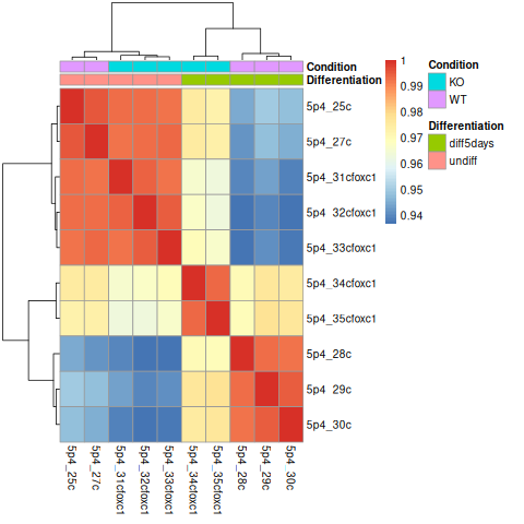
Are the samples clustering as expected? Are they clustering better by differentiation or by condition?
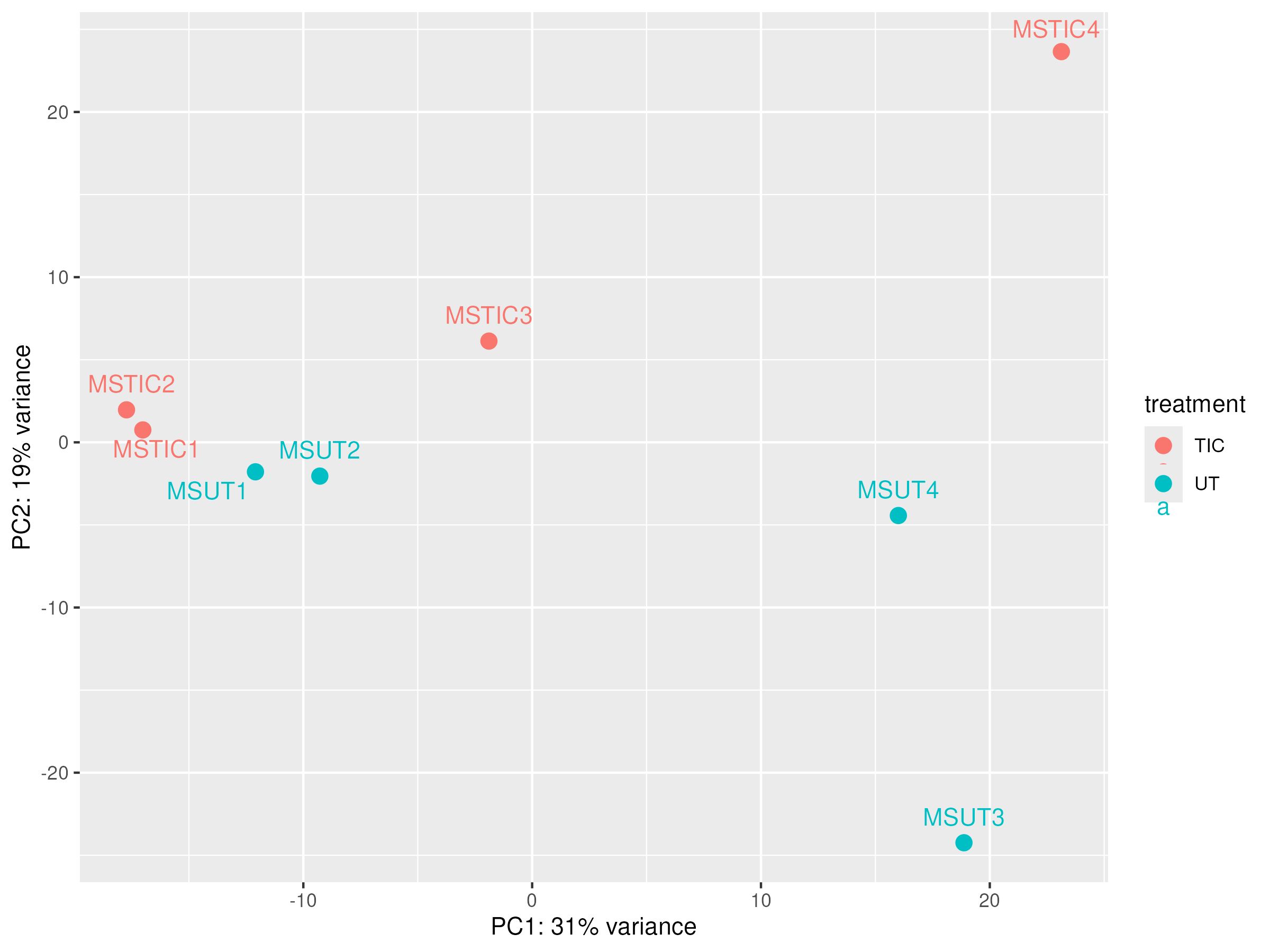
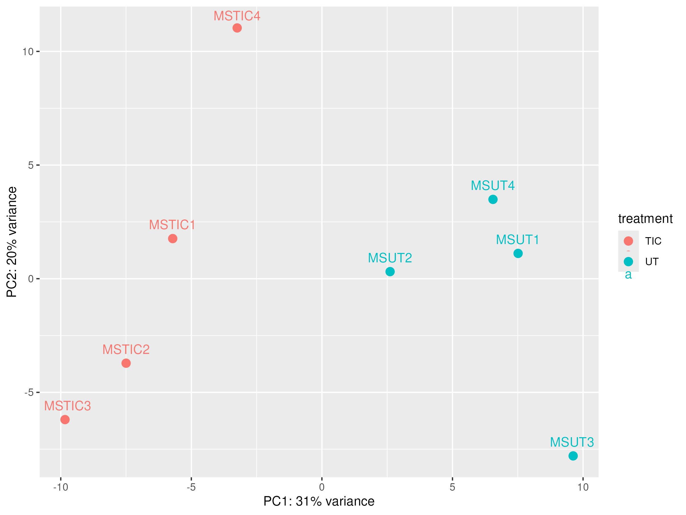
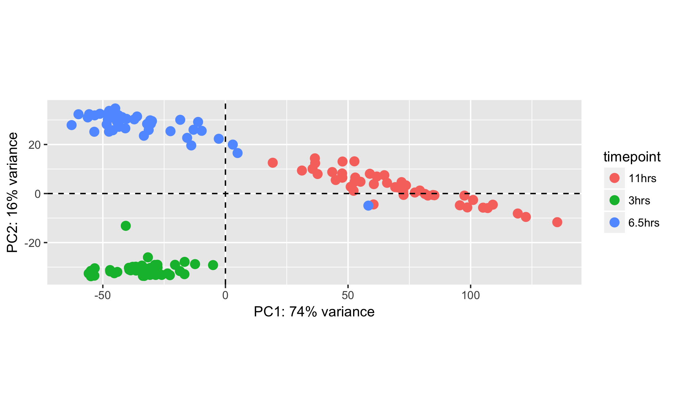
Principal Component Analysis (PCA)
Because we can not represent each sample in 20.000 dimensions (number of genes).PCA is used to reduce the dimensionality where each dot is a sample. The axes (PC1, PC2) are not individual genes — they are linear combinations of thousands of genes, weighted by how much they contribute to that PC’s direction. Samples that are close together have similar overall expression profiles; samples far apart are very different.
png("PCA_star.png")
plotPCA(object = se_vst,
  intgroup = c("Condition", "Differentiation"))
dev.off()
|
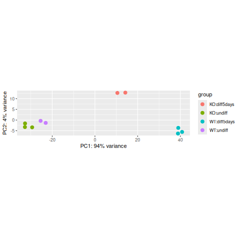
The horizontal axis (PC1 = Principal Component 1) represents the highest variation between the samples. Differences along PC1 are more important than differences along PC2.
For the PC1 axis, do samples separate by differentiation or by condition?
Interpreting the PCA plot
At this stage, the PCA plot allows us to evaluate whether samples belonging to the same experimental condition cluster together. Ideally, biological replicates should appear close to each other in the plot, indicating similar global gene expression profiles.
Do samples cluster by the biological condition you care about (treatment vs control, WT vs KO)?
Or do any samples cluster by other factors such as batch, RNA quality, sex, differentiation?
If an individual sample does not cluster with the other replicates of its condition, it may indicate a potential technical problem, such as low library complexity, RNA degradation, contamination, or a sample labeling error. In such cases, the sample should be carefully evaluated by reviewing quality control metrics, and sample annotation before deciding whether it should be retained or excluded from further analysis.
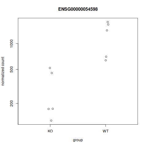
Gene expression plots
We can also plot the normalized counts of a gene per sample / experimental group:
# FOXC1 is ENSG00000054598
plotCounts(se_star2, gene="ENSG00000054598", intgroup="Condition")
|
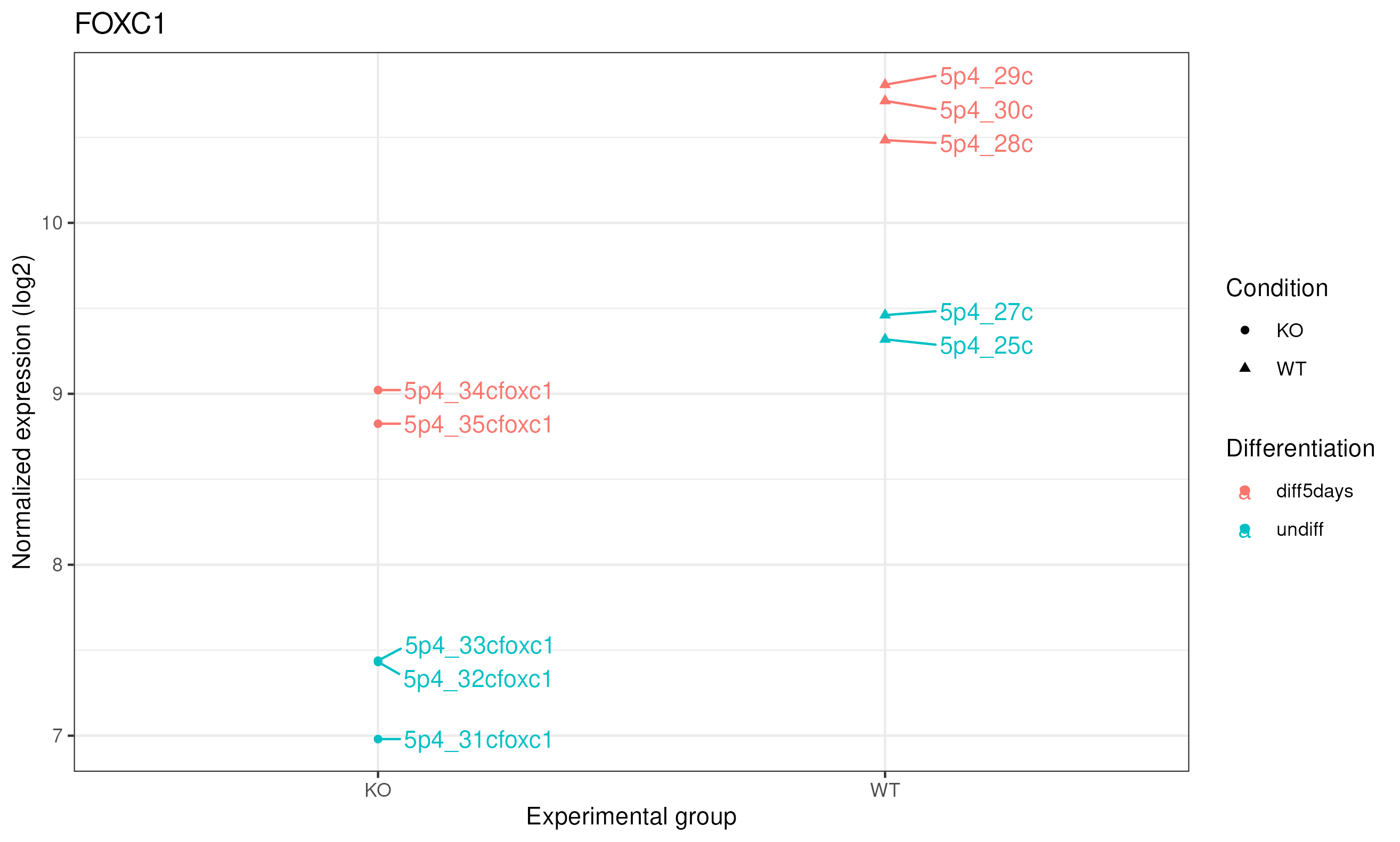
Let’s produce a more comprehensive plot: we can add the sample names and the differentiation status. To do so, we can use the ggplot2 package.
library(ggplot2)
library(ggrepel)
library(reshape2)

# Retrieve the normalized counts per sample for FOXC1 / ENSG00000054598
tmp <- norm_counts[rownames(norm_counts)=="ENSG00000054598",]

# convert to "long" format
mygenelong <- melt(tmp)

# sample name
mygenelong$name <- rownames(mygenelong)

# sample Condition and Differentiation: merge with sample table
mygenelong <- merge(mygenelong, sampletable, by.x="name", by.y="SampleName", all=F)

# Dot plot
pdot <- ggplot(data=mygenelong, mapping=aes(x=Condition, y=value, col=Differentiation, shape=Condition, label=name)) +
  geom_point() +
  geom_text_repel(nudge_x=0.2) +
  xlab(label="Experimental group") +
  ylab(label="Normalized expression (log2)") +
  labs(title = "FOXC1") +
  theme_bw()

ggsave("counts_foxc1_nice.png", pdot)
|
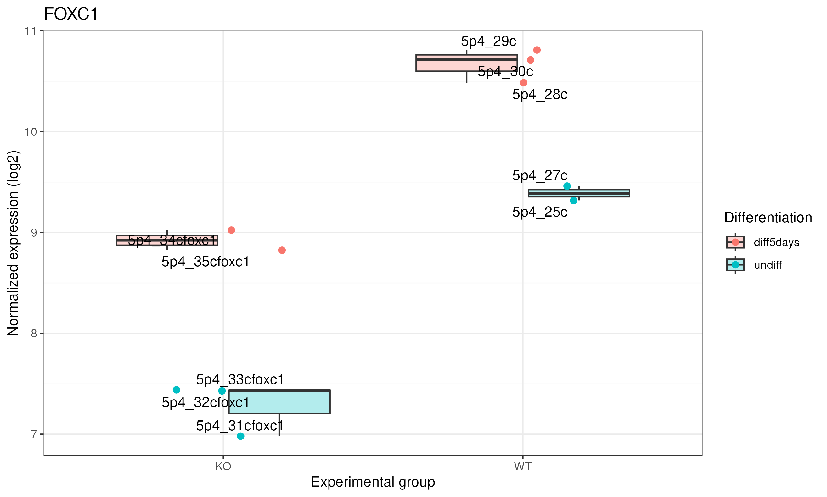
We can represent it as a boxplot:
# Boxplot
pbox <- ggplot(data=mygenelong,
               mapping=aes(x=Condition, y=value, fill=Differentiation, label=name)) +
  geom_boxplot(alpha = 0.3) +
  geom_jitter(aes(color=Differentiation), width=0.2, size=2)+
  geom_text_repel() +
  xlab("Experimental group") +
  ylab("Normalized expression (log2)") +
  labs(title = "FOXC1") +
  theme_bw()

ggsave("counts_foxc1_nice_boxplot.png", pbox)
Here we can see clearly that in KO this gene was expressed 2^1.5 times higher in 5 days, and same for WT.
|
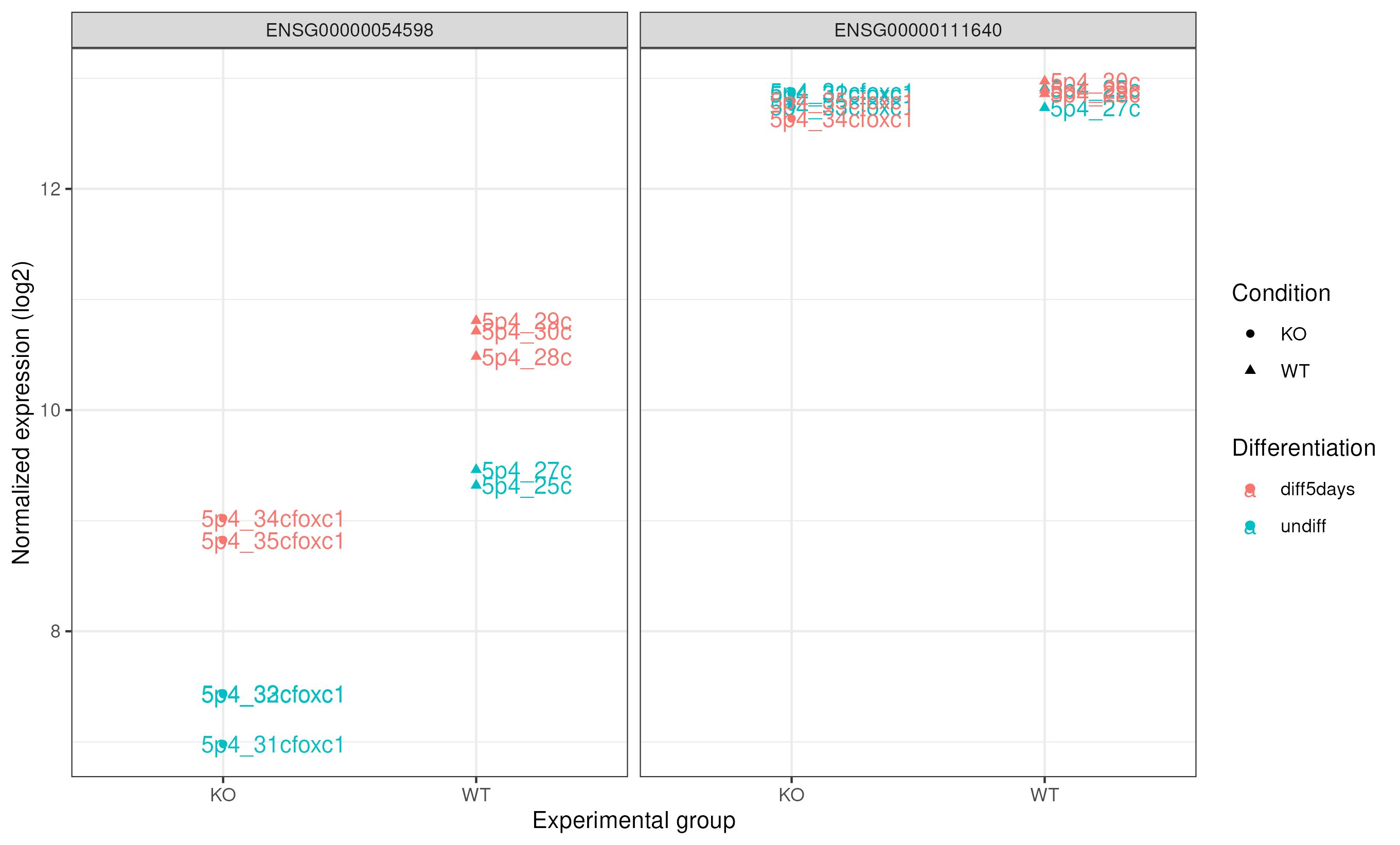
Comparing FOXC1 and GAPDH expression
Also, we can compare the expression of our study gene with a control gene (GADPH). GAPDH ensembl id ENSG00000111640
# Retrieve the normalized counts per sample for FOXC1 (ENSG00000054598) and GAPDH (ENSG00000111640) genes
tmp<-norm_counts[c("ENSG00000054598","ENSG00000111640"),]

# convert to "long" format
mygenelong <- melt(tmp)
mygenelong

# sample name
colnames(mygenelong) <- c("gene","name","value")

# sample Condition and Differentiation: merge with sample table
mygenelong <- merge(mygenelong, sampletable, by.x="name", by.y="SampleName", all=F)
mygenelong

# Dot plot
pdot_comp <- ggplot(data=mygenelong, mapping=aes(x=Condition, y=value, col=Differentiation, shape=Condition, label=name)) +
  geom_point() +
  geom_text(nudge_x=0.2) +
  xlab(label="Experimental group") +
  ylab(label="Normalized expression (log2)") +
  facet_wrap(~ gene) +
  theme_bw()

ggsave("counts_foxc1_gapdh.png", pdot_comp)
|
Differential expression analysis
Now is the moment to retrieve the results of the differential expression analysis for the constrast we are interested in. In this case, it is the comparison between WT and KO.
From results we will obtain the following columns each one with a value for each gene:
|baseMean|log2FoldChange|lfcSE|stat|pvalue|padj|
# check results names: depends on what was modeled. Here it was the "Condition"
resultsNames(se_star2)

# extract results for WT vs KO
 # contrast: the column from the metadata that is used for the grouping of the samples (Condition), then WT is compared to the KO -> results will be as "WT vs KO"
de <- results(object = se_star2,
  name="Condition_WT_vs_KO")
# This is equivalent to:
de <- results(object = se_star2, contrast=c("Condition", "WT", "KO"))

# If you want the results to be expressed as "KO vs WT", you can run:
# de <- results(object = se_star2, contrast=c("Condition", "KO", "WT"))

# check first rows
head(de)

# add more annotation to "de"
de_symbols <- merge(data.frame(ID=rownames(de), de, check.names=FALSE), annot, by.x="ID", by.y="ensembl_gene_id", all=F)

# write differential expression analysis result to a text file
write.table(de_symbols, "deseq2_results.txt", quote=F, col.names=T, row.names=F, sep="\t")
DESeq2 output
log2 fold change: A positive fold change indicates an increase of expression while a negative fold change indicates a decrease in expression for a given comparison. This value is reported in a logarithmic scale (base 2): for example, a log2 fold change of 1.5 in the “WT vs KO comparison” means that the expression of that gene is increased, in the WT relative to the KO, by a multiplicative factor of 2^1.5 ≈ 2.82.
log2 fold change |
Fold change (condition B vs A) |
Interpretation |
|---|---|---|
log2 = 1 |
2-fold change |
gene is 2× higher in condition B |
log2 = 2 |
4-fold change |
gene is 4× higher in condition B |
log2 = 3 |
8-fold change |
gene is 8× higher in condition B |
log2 = -1 |
2-fold lower |
gene is 2× lower in condition B |
log2 = -2 |
4-fold lower |
gene is 4× lower in condition B |
log2 = -3 |
8-fold lower |
gene is 8× lower in condition B |
pvalue: Wald test p-value: Indicates whether the gene analysed is likely to be differentially expressed in that comparison. The lower the more significant.
padj: Bonferroni-Hochberg adjusted p-values (FDR): the lower the more significant. More robust than the regular p-value because it controls for the occurrence of false positives.
baseMean: Mean of normalized counts for all samples.
lfcSE: Standard error of the log2FoldChange.
stat: Wald statistic: the log2FoldChange divided by its standard error.
Note on p-values set to NA
Some values in the results table can be set to NA for one of the following reasons (from Analyzing RNA-seq data with DESeq2 by M. Love et al., 2017):
If within a row, all samples have zero counts, the baseMean column will be zero, and the log2 fold change estimates, p value and adjusted p value will all be set to NA.
If a row contains a sample with an extreme count outlier then the p value and adjusted p value will be set to NA. These outlier counts are detected by Cook’s distance. If there are very many outliers (e.g. many hundreds or thousands) reported by summary(res), one might consider further exploration to see if a single sample or a few samples should be removed due to low quality.
If a row is filtered by automatic independent filtering, for having a low mean normalized count, then only the adjusted p value will be set to NA. This independent filtering can be customized or turned off in the DESeq2 function results(dds, independentFiltering=FALSE).
Volcano plot
A volcano plot combines effect size and statistical significance into a single view, making it one of the most widely used plots in differential expression analysis.
library(EnhancedVolcano)

## Let's select the columns with the gene.name, Log2 foldchange and padjusted value information.
colnames(de_symbols)
res_for_volc <- de_symbols[, c("external_gene_name","log2FoldChange","padj")]

volcano_plot <- EnhancedVolcano(res_for_volc,
                         lab = res_for_volc$external_gene_name, #column with the gene names for the points out of the defined thresholds for Log2fc and pvalue
                         x = 'log2FoldChange',
                         pCutoff = 0.05, ## padjusted threshold
                         FCcutoff = 2,   ## Log2 fold change threshold to select upregulated and downregulated genes.
                         y = 'padj')

pdf("Volcano_plot_of_WT_vs_KO.pdf", width = 10, height = 8)
print(volcano_plot)
dev.off()
X-axis: log2 fold change (log2FC) — how much a gene’s expression changes between conditions. Positive values = higher in the first group; negative = lower.
Y-axis: −log10(padj) — the adjusted p-value on a negative log scale. The higher a point is on the Y-axis, the more statistically significant the difference.
Each dot is a gene. The plot naturally splits into four regions:
Region |
Meaning |
|---|---|
Top-right |
Significantly upregulated (high FC, low padj) |
Top-left |
Significantly downregulated (low FC, low padj) |
Bottom-center |
Not significant (low FC or high padj) |
Top-center |
Large statistical significance, but small fold change |
The name “volcano” comes from the shape: most genes cluster at the bottom (non-significant), with two “plumes” of significant genes rising on the left and right flanks.
How to read it
Focus on the top corners — genes that are both far from zero on the X-axis (large effect) and high on the Y-axis (highly significant). Those are the most biologically meaningful candidates.
|
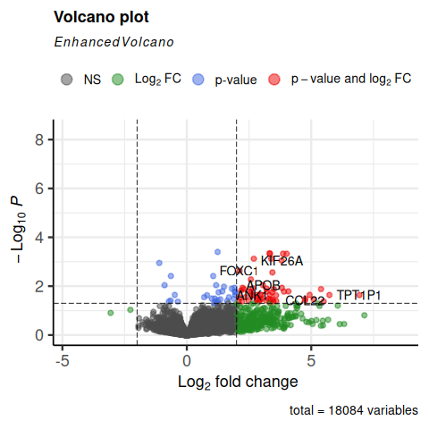
Do we see FOXC1 in the top corners?
Gene selection
padj (p-value corrected for multiple testing)
log2FC (log2 Fold Change)
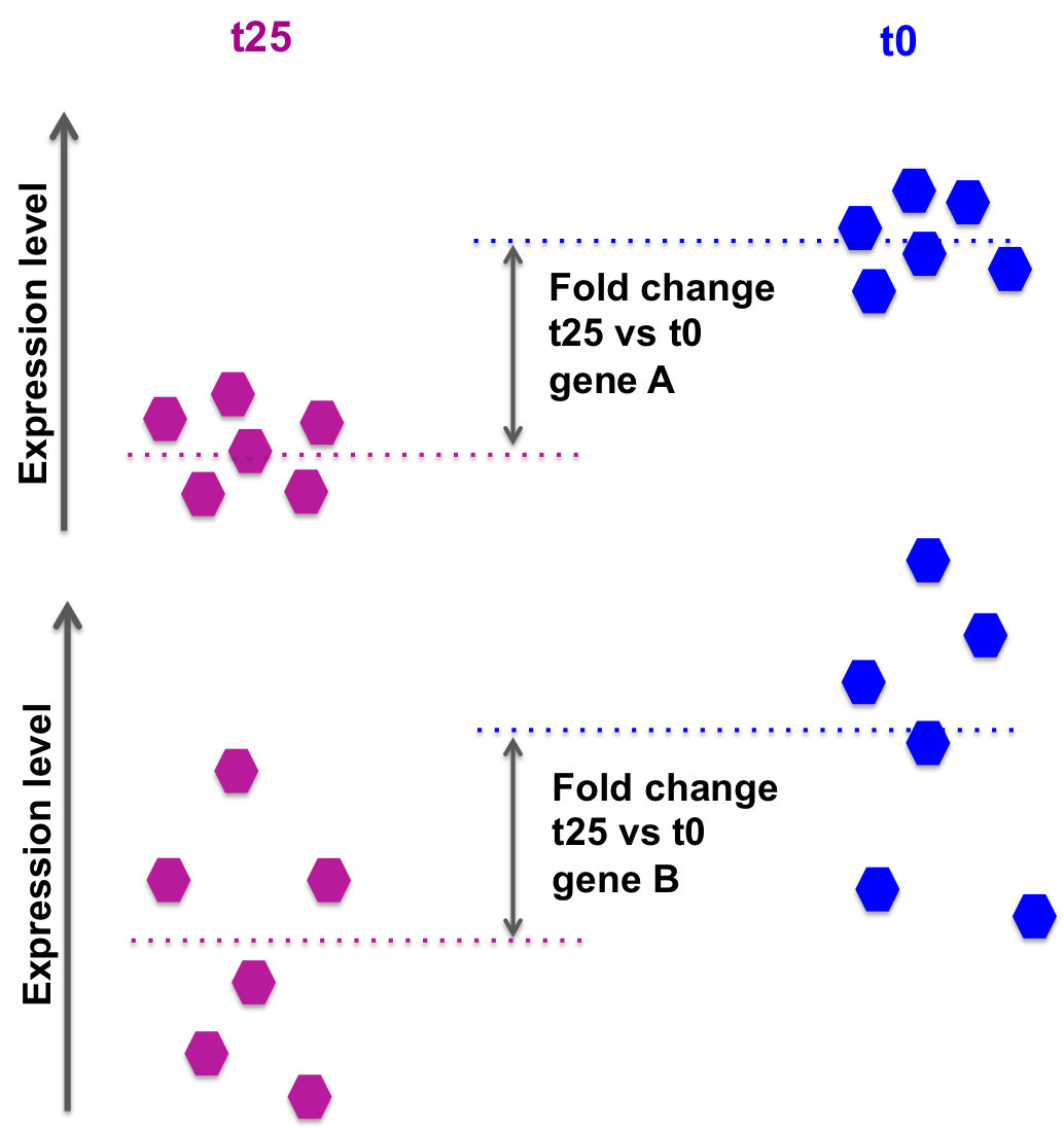
The log2FoldChange gives a quantitative information about the expression changes, but does not give information on the within-group variability, hence the reliability of the information:
In the picture below, fold changes for gene A and for gene B between groups t25 and t0 (from another data set) are the same, however the variability between the replicated samples in gene B is higher, so the result for gene A will be more reliable (i.e. the p-value will be smaller).
|
DESeq2 also takes into account the library size, sufficient coverage of a gene, …
We need to take into account the p-value or, better the adjusted p-value (padj).
Setting a p-value threshold of 0.05 means that there is a 5% chance that the observed result is a false positive. For thousands of simultaneous tests (as in RNA-seq, there are thousands of genes tested at the same time), 5% can result in a large number of false positives.
For example, if we test 20000 genes, and we use a p-value threshold of 0.05, we expect to have 1000 false positives.
The Benjamini-Hochberg procedure controls the False Discovery Rate (FDR) (it is one of many methods to adjust p-values for multiple testing).
A FDR adjusted p-value of 0.05 implies that 5% of significant tests according to the “raw” p-value will result in false positives.
So for 1000 significant genes at raw p-value < 0.05, we expect to have 50 false positives.
Selection of differentially expressed genes between WT and KO based on padj < 0.05.
# how many genes are differentially expressed, taking into account "padj < 0.05"?
# contains NAs... Filter them out
de_select <- de_symbols[de_symbols$padj < 0.05 & !is.na(de_symbols$padj),]
nrow(de_select)
# 85 genes

# save results in file for further usage
write.table(de_select, "deseq2_selection_padj005.txt", quote=F, col.names=T, row.names=F, sep="\t")
Selection of differentially expressed genes between WT and KO based on padj < 0.05 AND log2FC > 0.5 or log2FC < -0.5 (However, note that selecting by log2FoldChange is not required if the selection is done using the padj).
# how many genes are differentially expressed, taking into account "padj < 0.05" and log2FoldChange < -0.5 or > 0.5?
# contains NAs... Filter them out
de_select <- de_symbols[de_symbols$padj < 0.05 & !is.na(de_symbols$padj) & abs(de_symbols$log2FoldChange) > 0.5,]
nrow(de_select)
# 83 genes
Exercise 1
Is FOXC1 differentially expressed? What are the corresponding adjusted-value and log2FoldChanges?
Click to see the solution
de_select[de_select$external_gene_name == "FOXC1",]
How many genes are found differentially expressed if you change the log2FoldChange threshold to 0.8 / -0.8 and the padj threshold to 0.01?
Click to see the solution
de_select <- de_symbols[de_symbols$padj < 0.01 & !is.na(de_symbols$padj) & abs(de_symbols$log2FoldChange) > 0.8,]
nrow(de_select)
Exercise 2
Repeat the analysis comparing WT vs KO for the undifferentiated samples only!
Steps are:
Modify the “sampletable” so that it contains only samples corresponding to “undiff” Differentiation state.
SampleName |
FileName |
Differentiation |
Condition |
|---|---|---|---|
5p4_25c |
SRR3091420_1_counts.txt |
undiff |
WT |
5p4_27c |
SRR3091421_1_counts.txt |
undiff |
WT |
5p4_31cfoxc1 |
SRR3091425_1_counts.txt |
undiff |
KO |
5p4_32cfoxc1 |
SRR3091426_1_counts.txt |
undiff |
KO |
5p4_33cfoxc1 |
SRR3091427_1_counts.txt |
undiff |
KO |
Read in data DESeqDataSetFromHTSeqCount()
Filter out low counts (keep high counts)
Fit statistical model DESeq()
VST-transform counts vst()
Plot PCA and sample-to-sample distances heatmap
Check differential expression resultsNames()
How many genes are differentially expressed, when considering padj < 0.05?
DON’T FORGET TO WRITE FILES DOWN AT EACH STEP!!
Click to see the solution
mkdir ~/rnaseq_course/differential_expression/undiff
cd ~/rnaseq_course/differential_expression/undiff

```r

setwd("~/rnaseq_course/differential_expression/undiff")

## DESeq2 analysis

library(DESeq2)

# Create sample sheet

sampletable <- data.frame(SampleName=c("5p4_25c", "5p4_27c", "5p4_28c", "5p4_29c", "5p4_30c", "5p4_31cfoxc1", "5p4_32cfoxc1", "5p4_33cfoxc1", "5p4_34cfoxc1", "5p4_35cfoxc1"),
                          FileName=c("SRR3091420_counts.txt", "SRR3091421_counts.txt", "SRR3091422_counts.txt", "SRR3091423_counts.txt", "SRR3091424_counts.txt", "SRR3091425_counts.txt", "SRR3091426_counts.txt", "SRR3091427_counts.txt", "SRR3091428_counts.txt", "SRR3091429_counts.txt"),
                          Differentiation=c(rep("undiff", 2), rep("diff5days", 3), rep("undiff", 3), rep("diff5days", 2)),
                          Condition=c(rep("WT", 5), rep("KO", 5)))
rownames(sampletable) <- gsub("_counts.txt", "", sampletable$FileName)
# Modify sample sheet to keep only "undiff" samples

sampletable2 <- sampletable[sampletable$Differentiation=="undiff",]

# Import STAR counts
se_star <- DESeqDataSetFromHTSeqCount(sampleTable = sampletable2,
                                      directory = "counts_STAR_selected",
                                      design = ~ Condition)

# Filter out lowly expressed genes
 # i.e. (keep genes for which sums of raw counts across experimental samples is > 10)

se_star <- se_star[rowSums(counts(se_star)) > 10, ]

# Annotate
gene_ids <- rownames(se_star)

library(biomaRt)

mart <- useMart(biomart="ENSEMBL_MART_ENSEMBL", host="https://sep2025.archive.ensembl.org", path="/biomart/martservice", dataset="hsapiens_gene_ensembl")

annot <- getBM(attributes=c('ensembl_gene_id', 'chromosome_name', 'start_position', 'end_position', 'description', 'external_gene_name'), filters ='ensembl_gene_id', values = gene_ids, mart = mart)

# Fit statistical model

se_star2 <- DESeq(se_star)

# Compute normalized counts
norm_counts <- log2(counts(se_star2, normalized = TRUE)+1)

# add annotation to count table
norm_counts_symbols <- merge(data.frame(ID=rownames(norm_counts), norm_counts, check.names=FALSE), annot, by.x="ID", by.y="ensembl_gene_id", all=F)

# Let's sabe our results in the undiff folder
setwd("~/rnaseq_course/differential_expression/undiff")

# write normalized counts to text file
write.table(norm_counts_symbols, "normalized_counts_log2_star_undiff.txt", quote=F, col.names=T, row.names=F, sep="\t")

# Transform counts for visualization
se_vst <- vst(se_star2)

# Build heatmap
# load libraries pheatmap to create the heatmap plot
library(pheatmap)

# calculate between-sample distance matrix
sampleDistMatrix <- as.matrix(dist(t(assay(se_vst))))

# prepare a "metadata" object to add a colored bar with the differentiation and condition information
metadata <- sampletable2[,c("Differentiation", "Condition")]
rownames(metadata) <- sampletable2$SampleName

# create figure in PNG format
png("sample_distance_heatmap_star_undiff.png")
pheatmap(sampleDistMatrix, annotation_col=metadata)
# close PNG file after writing figure in it
dev.off()

# Principal component analysis
png("PCA_star_undiff.png")
plotPCA(object = se_vst,
        intgroup = c("Condition", "Differentiation"))
dev.off()

# Differential expression analysis
de <- results(object = se_star2,
              name="Condition_WT_vs_KO")
# add annotation
de_symbols <- merge(data.frame(ID=rownames(de), de, check.names=FALSE), annot, by.x="ID", by.y="ensembl_gene_id", all=F)

# write differential expression analysis result to a text file
write.table(de_symbols, "deseq2_results_undiff.txt", quote=F, col.names=T, row.names=F, sep="\t")

# Select genes for which padj < 0.05
de_select <- de_symbols[de_symbols$padj < 0.05 & !is.na(de_symbols$padj),]
nrow(de_select)

# save results in file for further usage
write.table(de_select, "deseq2_selection_padj005_undiff.txt", quote=F, col.names=T, row.names=F, sep="\t")
Exercise 3
Control for “Differentiation”
While in Exercise 2 we tested WT vs KO on undifferentiated samples only, we can also use a more complex design formula. If we specify:
~ Differentiation + Condition
it means that we want to test for the effect of the FOXC1 knock out, while controlling for the effect of differentiation. In a way, we “discard” the expected changes due to differentiation to focus on the changes specifically driven by the KO.
Repeat the first analysis, changing the design ~ Condition to ~ Differentiation + Condition.
How many genes are now found differentially expressed, when filtering for padj < 0.05?
Click to see the solution
setwd("~/rnaseq_course/differential_expression")

sampletable <- read.table("sample_sheet_foxc1.txt", header=T, sep="\t")
colnames(sampletable)

se_star <- DESeqDataSetFromHTSeqCount(sampleTable = sampletable,
                                      directory = "counts_STAR_selected",
                                      design = ~ Differentiation + Condition)
se_star
se_star <- se_star[rowSums(counts(se_star)) > 10, ]

se_star2 <- DESeq(se_star)

de <- results(object = se_star2, contrast=c("Condition", "WT", "KO"))
de_symbols <- merge(data.frame(ID=rownames(de), de, check.names=FALSE), annot, by.x="ID", by.y="ensembl_gene_id", all=F)


## How many genes are now found differential expressed, when filtering for padj < 0.05.

de_select <- de_symbols[de_symbols$padj < 0.05 & !is.na(de_symbols$padj),]
nrow(de_select)
Homework
Do the same using the Salmon counts (object se_salmon): how many genes are found differentially expressed when using the Salmon counts? How do results overlap between STAR and Salmon?
Click to see the solution
Prepare transcript-to-gene annotation file (Salmon)
Prepare the annotation file needed to import the Salmon counts: a two-column data frame linking transcript id (column 1) to gene id (column 2).
We will add the gene symbol in column 3, for a more comprehensive annotation.
Process from the GTF file:
cd ~/rnaseq_course/differential_expression

# Gencode annotation for all chromosomes
wget ftp://ftp.ebi.ac.uk/pub/databases/gencode/Gencode_human/release_49/gencode.v49.annotation.gtf.gz

# first column is the transcript ID, second column is the gene ID, third column is the gene symbol
zcat gencode.v49.annotation.gtf.gz | awk -F "\t" 'BEGIN{OFS="\t"}{if($3=="transcript"){split($9, a, "\""); print a[4],a[2],a[8]}}' > tx2gene.gencode.v49.csv
Preparing annotation file with gene id, gene names, gene type, chromosome, start, end and strand information.
cd ~/rnaseq_course/differential_expression

zcat gencode.v49.annotation.gtf.gz | awk -v OFS='\t' '{ if ($3=="gene") { gsub(";",""); gsub("\"",""); print $10,$14,$12,$1,$4,$5,$7} }' > salmon_gene_anno.txt
Import Salmon counts
Load the count data from SALMON into a DESeq object:
# Go to the deseq2 directory
setwd("~/rnaseq_course/differential_expression")

annot <- read.table("salmon_gene_anno.txt", header=T)

# Load the tximport package that we use to import Salmon counts
library(tximport)

# List the quantification files from Salmon: one quant.sf file per sample

# dir is list all files in "~/rnaseq_course/differential_expression/counts_salmon" and in any directories inside, that have the pattern "quant.sf". full.names = TRUE means that we want to keep the whole paths
files <- dir("~/rnaseq_course/differential_expression/full_data_counts/counts_salmon", recursive=TRUE, pattern="quant.sf", full.names=TRUE)
files

# files is a vector of file paths. we will name each element of this vector with a simplified corresponding sample name
names(files) <- gsub("_quant.sf", "", dir("~/rnaseq_course/differential_expression/full_data_counts/counts_salmon"))
names(files)

# Read in the two-column data.frame linking transcript id (column 1) to gene id (column 2)
transcripts2genes <- read.table("tx2gene.gencode.v49.csv",
  sep="\t",
  header=F)

# tximport can import data from Salmon, Kallisto, Sailfish, RSEM, Stringtie

# here we summarize the transcript-level counts to gene-level counts
txi <- tximport(files,
  type = "salmon",
  tx2gene = transcripts2genes)

# check the names of the "slots" of the txi object
names(txi)

# display the first rows of the counts per gene information
head(txi$counts)

# Create a DESeq2 object based on Salmon per-gene counts
se_salmon <- DESeqDataSetFromTximport(txi,
   colData = sampletable,
   design = ~ Condition)


# Load the annotation file to annotate the normalized and differential expression results

annot <- read.table("salmon_gene_anno.txt", as.is=T)
colnames(annot) <- c("gene_id","gene_name","gene_type",'chromosome_name', 'start_position', 'end_position','strand')
From that step on, you can proceed the same way with se_star.
Other cases
Batch effect in the data
Sometimes, we perform RNA-seq experiments one year, and then another year later with the same study, making us wonder if we can merge data from the previous year in order to have more replicates and a better statistical power.
Other times, some samples are processed at different time points, by different operators, or using slightly different protocols (e.g. different RNA extraction kits, different library preparation lots, or different sequencing runs).
In all these cases, unintended technical variation can be introduced into the data — something known as a batch effect.
What is a batch effect?
A batch effect is systematic, non-biological variation in gene expression data introduced by technical factors such as:
Different sequencing runs or flow cells
Samples processed on different dates or by different operators
Different reagent lots or library prep kits
Samples stored under different conditions before RNA extraction
Batch effects can be just as large as (or larger than) the biological signal you are trying to detect, and will confound your differential expression results if not properly accounted for.
In the worst case scenario, batch effects becomes completely inseparable from the biological signal of interest. For example, if all your control samples were processed in batch 1 and all your treatment samples were processed in batch 2, you will not be able to distinguish between the effect of the treatment and the effect of the batch.
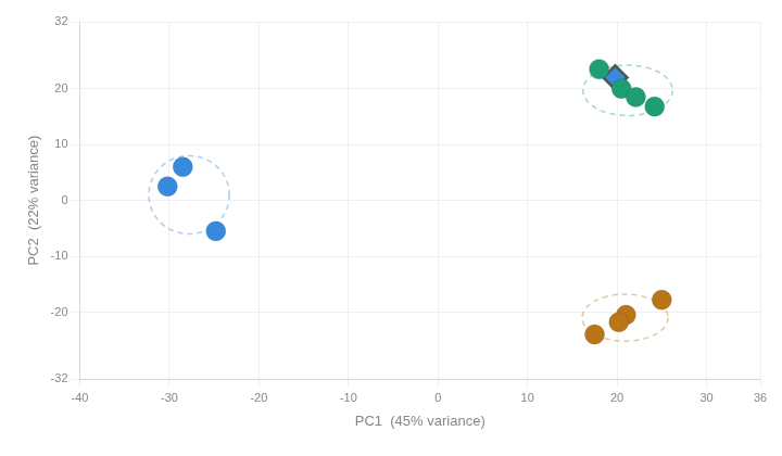
Detect batch effects using PCA
The first step is always to visualize the data and check whether samples cluster by their batch rather than by their biological condition of interest.
On the following example, we have samples that were processed at different weeks but RNA extraction was performed on the same day for all samples. A batch column indicating if samples were processed on week 1 (values = 1) or week 2 (values = 2) is included in the sample table.
Download batch raw counts and sample table data:
wget https://biocorecrg.github.io/RNAseq_coursesCRG_2026/latest/data/differential_expression/batch_example.tar.gz

tar -xvzf batch_example.tar.gz
rm batch_example.tar.gz
setwd("~/rnaseq_course/differential_expression/batch_example")
# Batch Effect Correction

batch_counts <- read.csv("rnaseq_batch_example_raw_counts.txt",header = TRUE, sep="\t")
head(batch_counts) ## this are annotated raw counts.

## Let's set the gene_id as row names
rownames(batch_counts) <- batch_counts$gene_id
colnames(batch_counts)

## Let's prepare matrix with only raw counts for DESeq
matrix_counts <- batch_counts[,9:length((batch_counts))]
colnames(matrix_counts)

## Here we separate the annotation from the counts
annot <- batch_counts[,1:8]
colnames(annot)

## Let's read the sample table
sampletable <- read.csv("batch_sample_table.txt", sep="\t", header=TRUE)
head(sampletable)

## Creating deseq object from counts matrix
se_matrix <- DESeqDataSetFromMatrix(countData = matrix_counts, colData = sampletable, design = ~treatment)
se_matrix

## Run DESeq
se_2 <- DESeq(se_matrix)

## VST, in this case we use variance stabilizing transformation to normalize the data because we have a small dataset.
se_vst <- varianceStabilizingTransformation(se_2)

### Let's extract PCA data into a table to create a plot with sample labels and detect samples in one batch and another.

pcaData <- plotPCA(se_vst, intgroup="treatment", returnData=TRUE) ## ReturnData=TRUE  return the data in a dataframe
percentVar <- round(100 * attr(pcaData, "percentVar")) ## Extracting explained variance (%) for PC1 and PC2

PCA_batch <- ggplot(pcaData, aes(PC1, PC2, color=treatment)) +
                geom_point(size=3) +
                geom_text_repel(aes(label=name), vjust=-1) +
                xlab(paste0("PC1: ", percentVar[1], "% variance")) +
                ylab(paste0("PC2: ", percentVar[2], "% variance"))

ggsave("PCA_batch.png",PCA_batch,  width = 8, height = 6)

## Batch correction with Combatseq

BiocManager::install("sva")
library(sva)

rownames(sampletable) <- sampletable$sampleName
batch <- sampletable$batch


mat_corrected <- ComBat_seq(
  counts = counts(se_matrix),
  batch = batch)

mat_corrected
head(mat_corrected)

se_correc <- DESeqDataSetFromMatrix(countData = mat_corrected, colData = sampletable, design = ~treatment)
vst_correct <- varianceStabilizingTransformation(se_correc)

png("PCA_batch_corrected.png")
plotPCA(object = vst_correct,
        intgroup = c("treatment"))
dev.off()

library(ggrepel)

pcaData <- plotPCA(vst_correct, intgroup="treatment", returnData=TRUE)
percentVar <- round(100 * attr(pcaData, "percentVar"))

pca_batch_correc <- ggplot(pcaData, aes(PC1, PC2, color=treatment)) +
                      geom_point(size=3) +
                      geom_text_repel(aes(label=name), vjust=-1) +
                      xlab(paste0("PC1: ", percentVar[1], "% variance")) +
                      ylab(paste0("PC2: ", percentVar[2], "% variance"))

ggsave("PCA_batch_corrected.png",pca_batch_correc,  width = 8, height = 6)
PCA before correction
|
PCA after correction
|
Homework
Another approach to take into account batch effect is to include the Batch variable in the DESeq2 design formula. This tells DESeq2 to model and account for the batch effect when estimating fold changes and p-values, without modifying the raw count data.
Note
More information https://www.biostars.org/p/403053/
Using the previous sample table and the matrix counts, create a DESeq2 object accounting for batch effect in the design formula.
# Re-create the DESeq2 object with Batch in the design
se_correc <- DESeqDataSetFromMatrix(
  countData = matrix_counts,
  colData = sampletable,
  design = ~batch + treatment  # Batch is controlled and treatment is tested
  )
Create a vst object and visualize your data using PCA. Does this approach corrects for batch effect?
Outliers detection
In some cases we can find samples that are not clustered with the others. This could be due to several reasons, such as sample preparation errors, technical issues, or biological differences between samples. In this case, we need a review of the different sequencing Quality Control parameters we studied previously to identify possible sample degradation, contamination, or other technical issues. If we find such issues, we can remove the outlier samples from the dataset and re-run the analysis.
|
Sample mislabeling
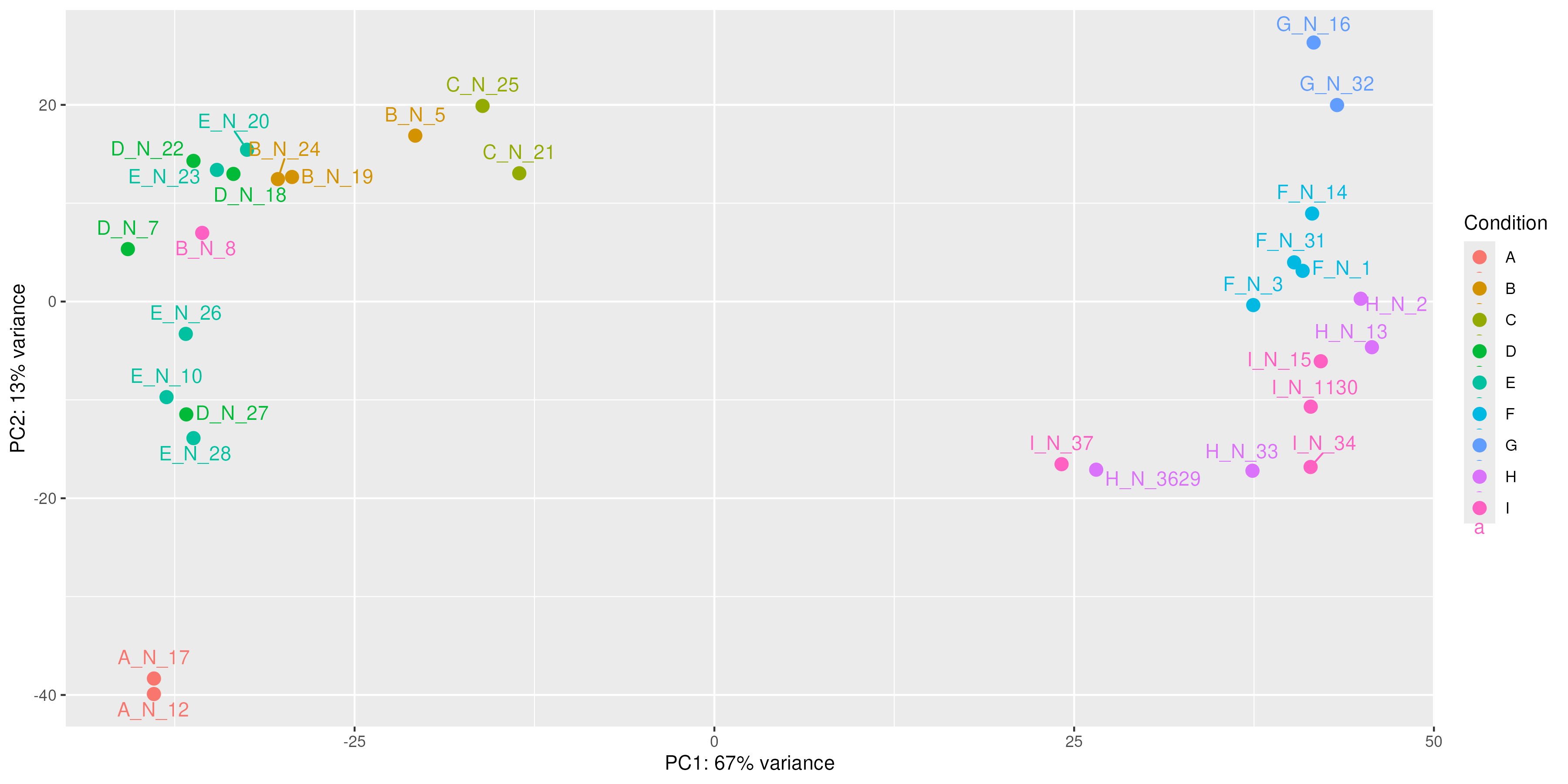
Sometimes during sample preparation or sample table creation, samples are mislabeled. This can be detected by visualizing the data and checking if samples cluster by their biological condition of interest.
|
Source: Image generated by Anthropic Claude (4.6 Sonnet), 2026, https://claud.ai/
Using the following sample table and matrix counts:
cd ~/rnaseq_course/differential_expression/

wget https://biocorecrg.github.io/RNAseq_coursesCRG_2026/latest/data/differential_expression/mislabeled_sample_example.tar.gz

tar -xvzf mislabeled_sample_example.tar.gz
rm mislabeled_sample_example.tar.gz
Create a DESeq2 object using the condition column as the design formula.
Generate vst normalized counts.
Visualize it using PCA.
¿Do you find any sample that is not in the cluster is should be in?
Click to see the solution
setwd("~/rnaseq_course/differential_expression/mislabeled_sample_example")

misl_counts <- read.csv("mislabeled_normalized_counts.txt",header = TRUE, sep="\t")
head(misl_counts) ## this are annotated raw counts.

## Let's prepare matrix with only raw counts for DESeq

rownames(misl_counts) <- misl_counts$gene_id
colnames(misl_counts)

matrix_counts <- misl_counts[,4:length((misl_counts))]
colnames(matrix_counts)
round(matrix_counts)

annot <- batch_counts[,1:3]
colnames(annot)

## Let's read the sample table

sampletable <- read.csv("Mislabeled_SampleTable.txt", sep="\t", header=TRUE)
head(sampletable)

rownames(sampletable) <- sampletable$SampleName

rownames(sampletable) %in% colnames(matrix_counts)

## Creating deseq object from counts matrix
se_matrix <- DESeqDataSetFromMatrix(countData = matrix_counts, colData = sampletable, design = ~Condition)
se_matrix

se_2 <- DESeq(se_matrix)

se_vst <- vst(se_2)

pcaData <- plotPCA(se_vst, intgroup="Condition", returnData=TRUE) ## ReturnData=TRUE  return the data in a dataframe
percentVar <- round(100 * attr(pcaData, "percentVar")) ## Extracting explained variance (%) for PC1 and PC2

PCA_misl <- ggplot(pcaData, aes(PC1, PC2, color=Condition)) +
  geom_point(size=3) +
  geom_text_repel(aes(label=name), vjust=-1) +
  xlab(paste0("PC1: ", percentVar[1], "% variance")) +
  ylab(paste0("PC2: ", percentVar[2], "% variance"))

ggsave("PCA_mislabeled.png",PCA_misl,  width = 12, height = 6)
|