19.4 Dot plots
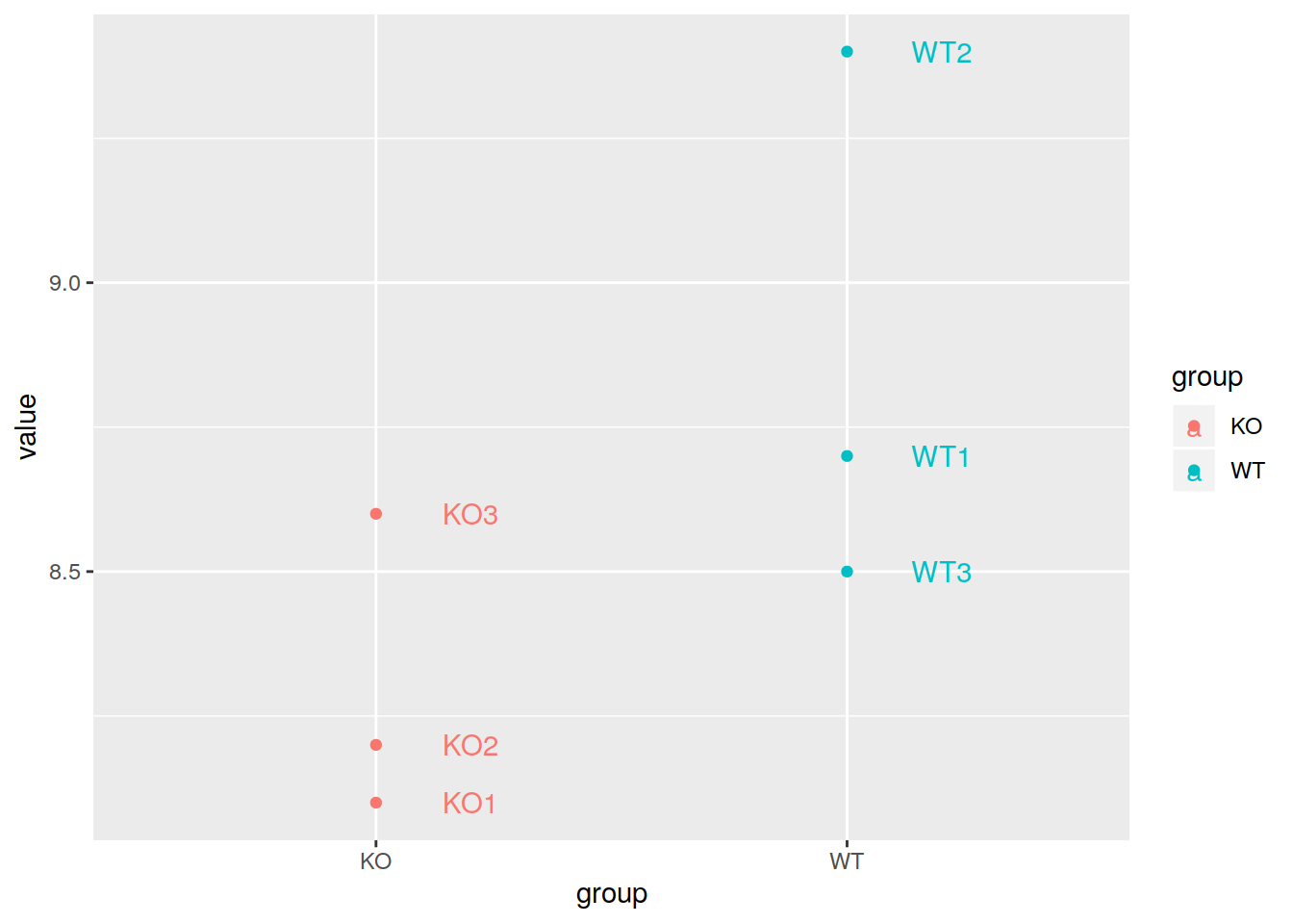
Example of the expression of a gene in 6 samples: 2 experimental groups in triplicates.
# create a named vector with the expression of a gene
mygene <- c(8.1, 8.2, 8.6, 8.7, 9.4, 8.5)

# the names of each element of the vector are sample names
names(mygene) <- c("KO1", "KO2", "KO3", "WT1", "WT2", "WT3")

# transform to long format
mygenelong <- melt(data=mygene)

# add new columns containing sample names and experimental groups
mygenelong$sample_name <- rownames(mygenelong)
mygenelong$group <- gsub("[1-3]{1}", "", mygenelong$sample_name)

# dot plot
  # add labels with "label" in the aes() and layer geom_text()
  # nudge_x adjust the labels horizontally
pdot <- ggplot(data=mygenelong, mapping=aes(x=group, y=value, col=group, label=sample_name)) +
  geom_point() +
  geom_text(nudge_x=0.2)

pdot
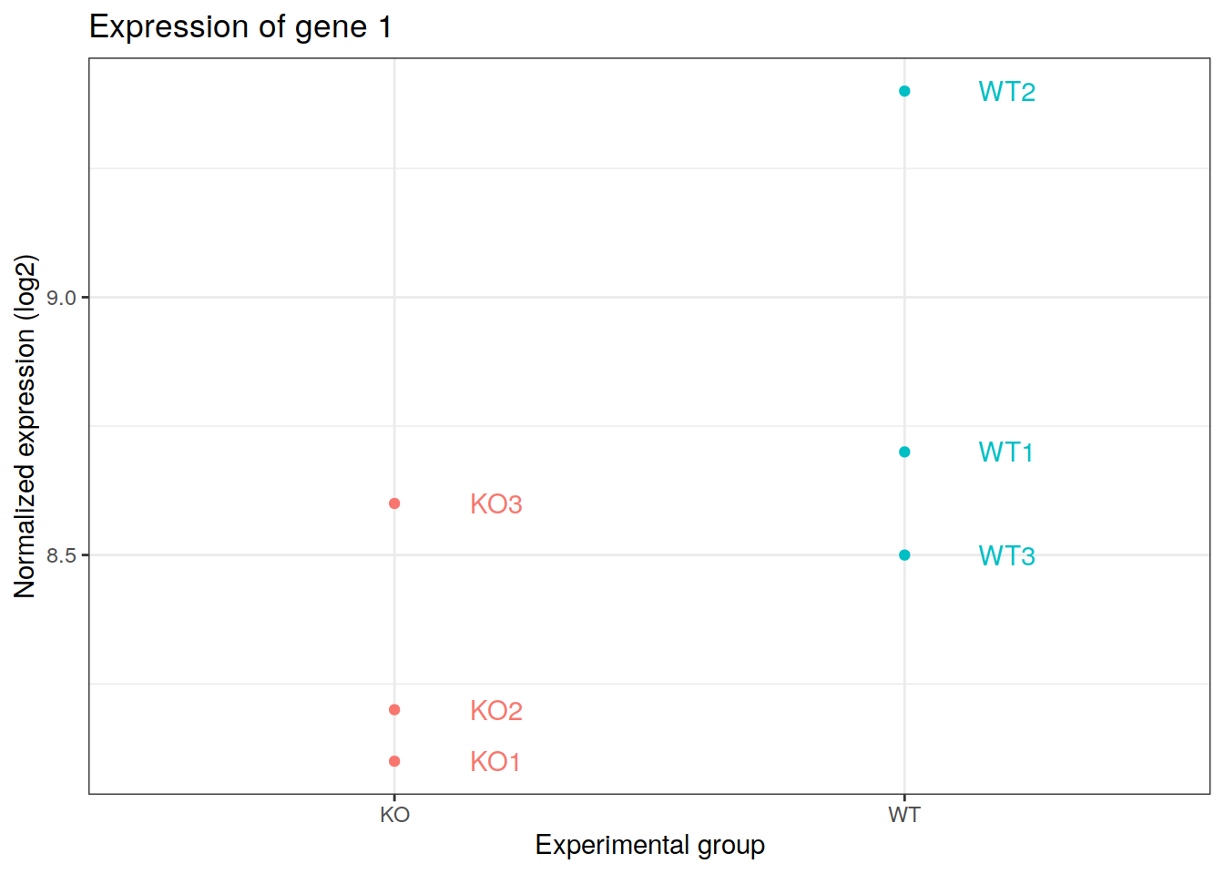
- Add more layers:
- xlab() to change the x axis label
- ylab() to change the y axis label
- theme to manage the legend
pdot +  xlab(label="Experimental group") +
  ylab(label="Normalized expression (log2)") +
  ggtitle(label="Expression of gene 1") +
  theme_bw() +
  theme(legend.position="none")