16.1 Scatter plots
A scatter plot has points that show the relationship between two sets of data.
- Simple scatter plot
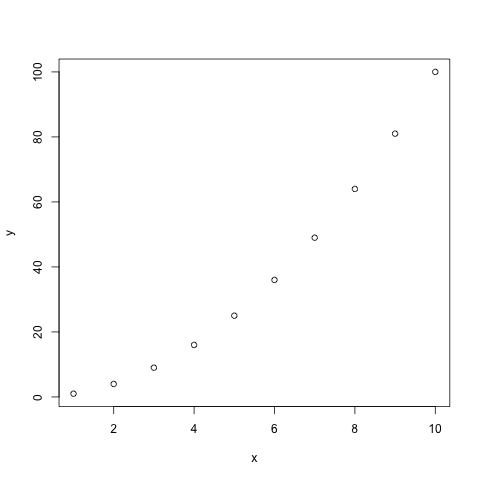
Note that if one vector only is given as an input, it will be plotted against the indices of each element
- Add arguments:
- col: color
- pch: type of point
- type: “l” for line, “p” for point, “b” for both point and line
- main: title of the plot
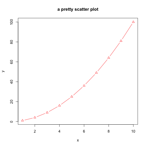
- You can play a bit:
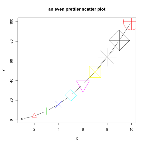
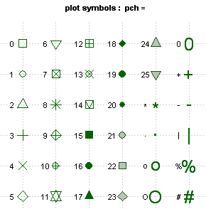
Different type of points that you can use:
About colors
- Color codes 1 to 8 are taken from the palette() function and respectively code for: “black”, “red”, “green3”, “blue”, “cyan”, “magenta”, “yellow”, “gray”.
- There is a larger set of build-in colors that you can use:
# see all 657 possible build-in colors:
colors()

# looking for blue only? You can pick from 66 blueish options:
grep("blue", colors(), value=TRUE)
You can also find them here.
- change the default palette with one of your choice:
- change the palette back to default