13.2 Bar plots
A bar chart or bar plot displays rectangular bars with lengths proportional to the values that they represent.
- A simple bar plot :
# Create a vector
mycenter <- rep(x=c("PhDstudent", "Postdoc", "Technician", "PI"),
                times=c(8,10,5,2))

# Count number of occurrences of each character string
mytable <- table(mycenter)

# Bar plot using that table
barplot(height=mytable)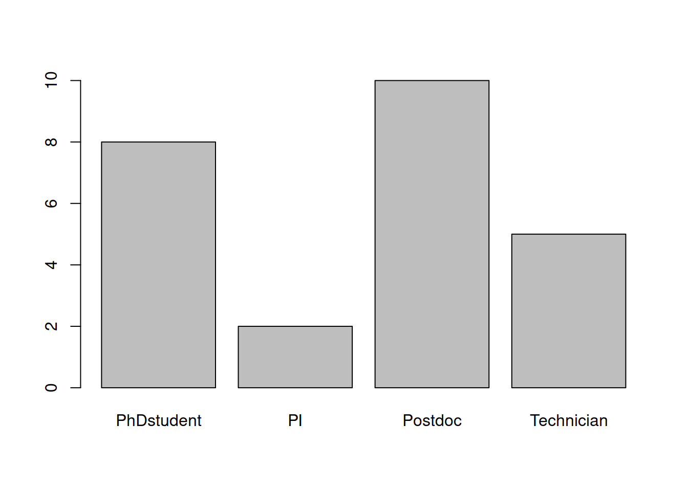
- Customize a bit :
- col : color
- main : title of the plot
- las : orientation of axis labels:
- 0: all labels parallel to axis
- 1: x-axis labels parallel / y-axis labels perpendicular
- 2: both labels perpendicular
- 3: x-axis labels perpendicular / y-axis labels parallel
barplot(height=mytable,
    col=1:4,
    main="bar plot",
    las=2)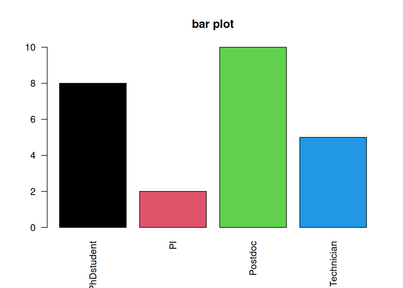
- Customize the ordering of the bars :
By default, the bars are organized in alphabetical order. You can change it using an ordered factor.
# Create an ordered factor out of mycenter: the order in which you write the "levels" is the sort in which the bars will next be plotted
xfact <- factor(x=mycenter,
    levels=c("PhDstudent", "Postdoc", "Technician", "PI"),
    ordered=TRUE)

# Produce the table
xfacttable <- table(xfact)

# Plot the same way
barplot(height=xfacttable,
    col=1:4,
        main="reorganized bar plot",
        las=2)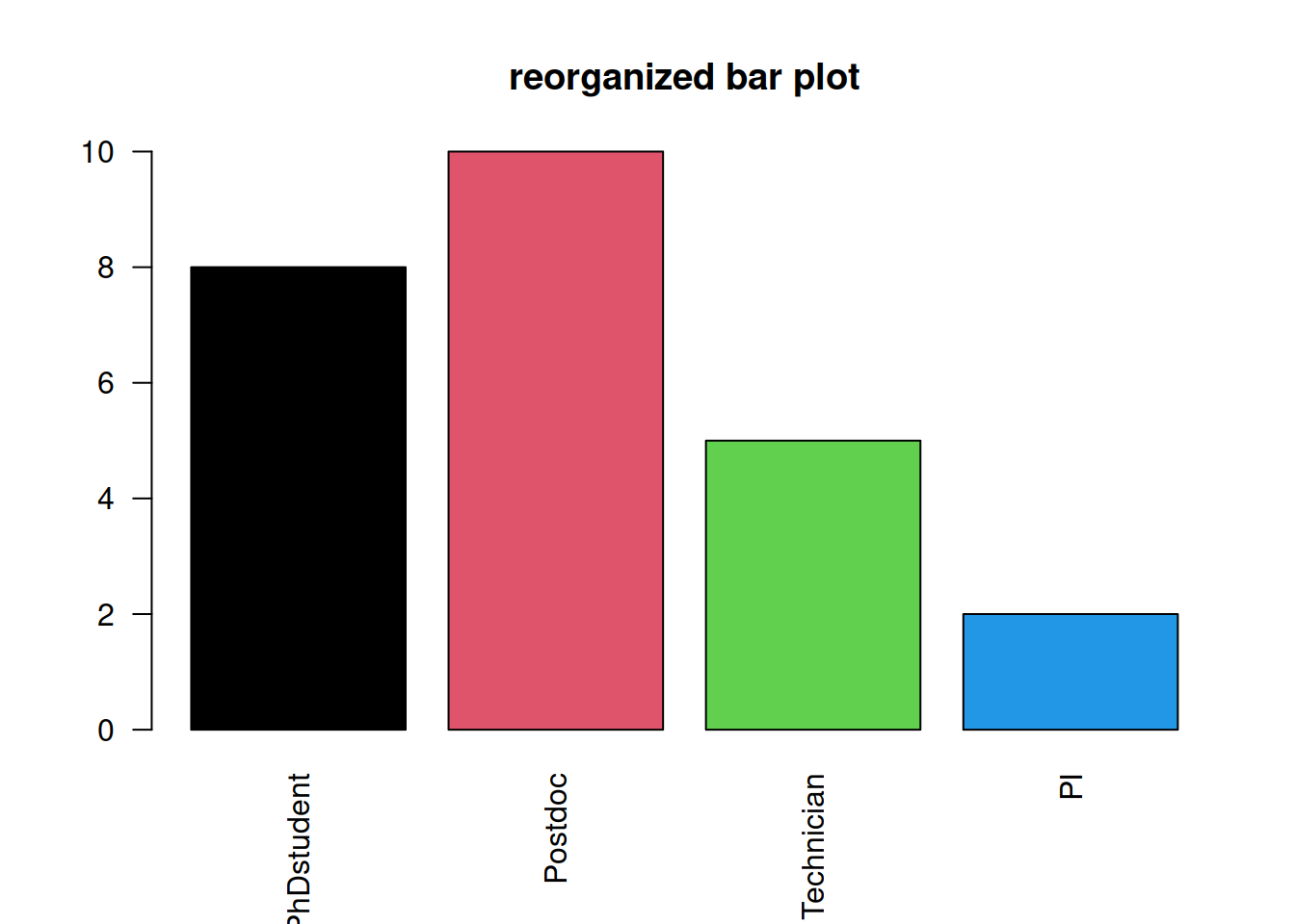
- We can also produce stacked barplot :
# Create a matrix containing the number and type of employees per research program :
barmat <- matrix(c(8, 10, 9, 2, 6, 4, 5, 3, 14, 13, 16, 4, 11, 10, 8, 5),
    nrow=4,
    dimnames=list(c("Technician", "PhDstudent", "PostDoc", "PI"), c("BG", "CDB", "GRSCC", "SB")))

# Plot barplot
barplot(height=barmat,
        col=sample(colors(), 4))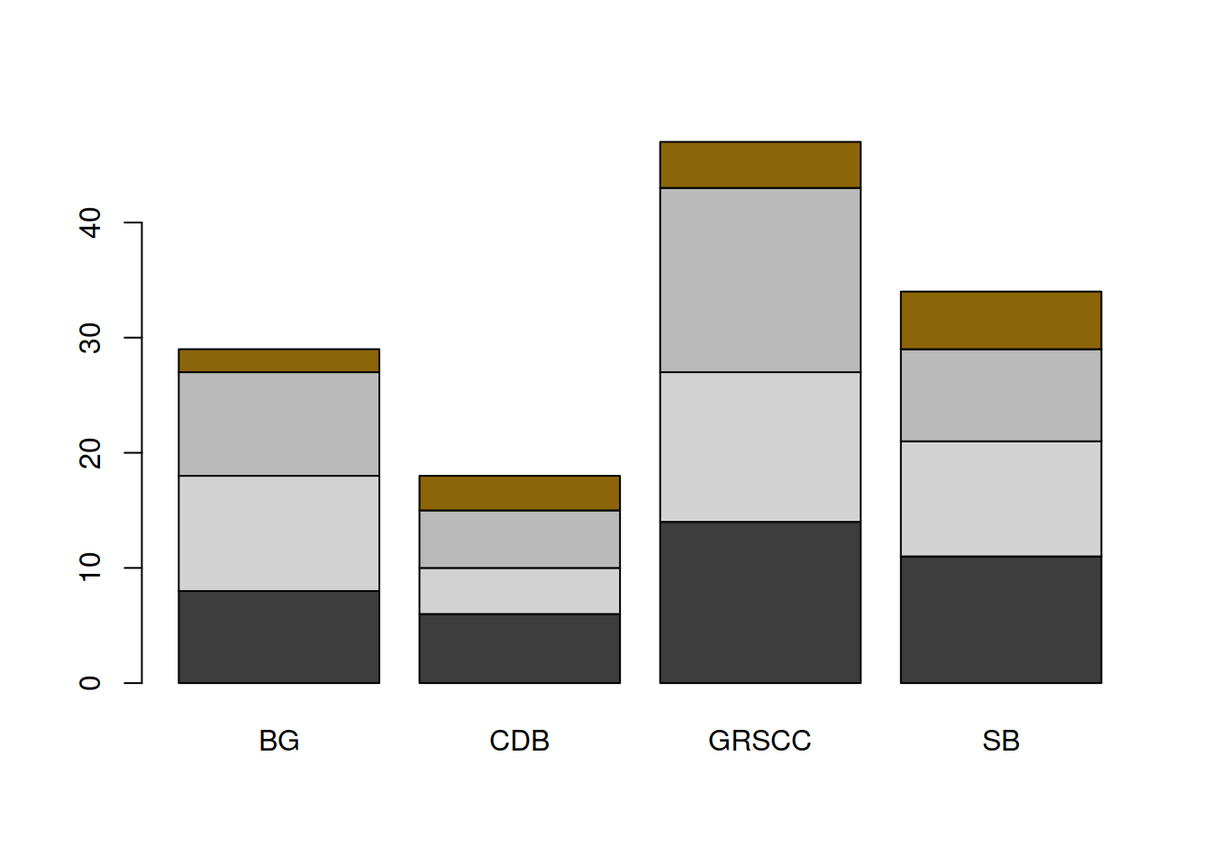
- Add some parameters:
# set a random color vector
  # add set.seed(38) (or any other number) to reproduce the randomization.
mycolors <- sample(x=colors(),
                   size=4)

# plot barplot
  # ylim sets the lower and upper limit of the y-axis: here it allows us to fit the legend !
barplot(height=barmat,
    col=mycolors,
    ylim=c(0,50),
    main="stacked barplot")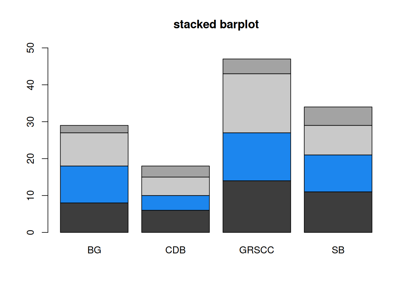
- Add a legend to the plot:
- “x” and “y” set the legend’s position in the plotting area: you can specify the position as coordinates using “x” and “y.”
- if “x” only is used, you can set the legend position as “topleft,” “bottomleft,” “topright,” “bottomright”
- Note:
barplot()(or any other plot function) has to be called first
barplot(height=barmat,
    col=mycolors,
    ylim=c(0,50),
    main="stacked barplot")

legend(x="topleft",
    legend=c("Technician", "PhDstudent", "PostDoc", "PI"),
    fill=mycolors)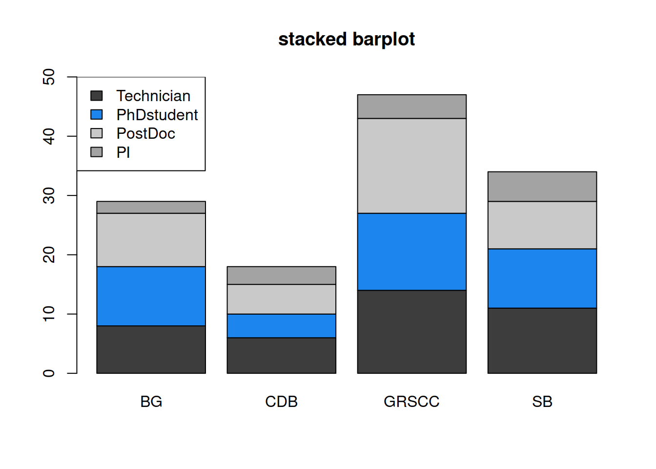
A more automated way to do this:
legend(x="topleft",
    legend=rownames(barmat),
    fill=mycolors)
HANDS-ON
The dataset chickwts is also a built-in dataset from the datasets package: the table measures and compares the effectiveness of various feed supplements on the growth rate of chickens.
- Create a barplot of the different feed supplements.
- Change the orientation of the x-axis labels.
- Try to re-organize the bars by the increasing number of feed supplements.
Answer
# Create a barplot of the different **feed supplements**.
tablefeed <- table(chickwts$feed)
barplot(tablefeed)

# Change the orientation of the x-axis labels.
barplot(tablefeed, las=2)

# Try to re-organize the bars by the increasing number of feed supplements.
  # check tablefeed and write the feed categories in increasing order:
feedfactor <- factor(x=chickwts$feed, levels=c("horsebean", "meatmeal", "casein", "linseed", "sunflower", "soybean"),
    ordered=TRUE))

  # a less "manual" way to proceed: tablefeed (the output of table() ) is a NAMED vector: sort it and retrieve its names in sorted order
sort(tablefeed)
names(sort(tablefeed))
feedfactor <- factor(x=chickwts$feed,
    levels=names(sort(tablefeed)),
    ordered=TRUE)

# plot sorted barplot
barplot(table(feedfactor), las=2)