16.2 Scatter plot
# Example of a scatter plot: add the geom_point() layer
ggplot(data=dataframe, mapping=aes(x=column1, y=column2)) + geom_point()- Example of a simple scatter plot:
# Create a data frame
df1 <- data.frame(sample1=rnorm(200), sample2=rnorm(200))

# Plot !
ggplot(data=df1 , mapping=aes(x=sample1, y=sample2)) +
    geom_point()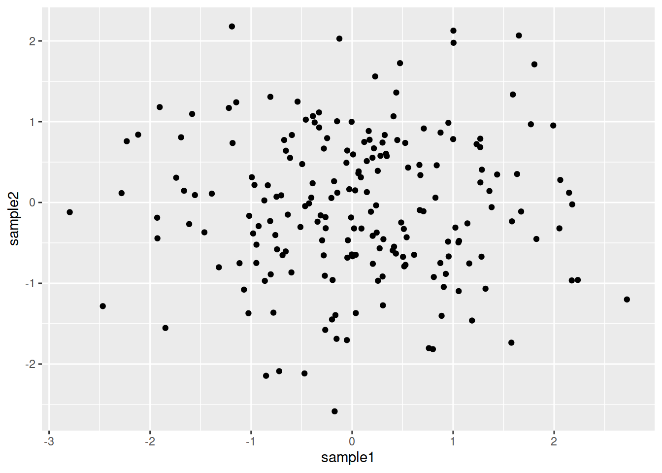
- Add layers to that object to customize the plot:
- ggtitle to add a title
- geom_vline to add a vertical line
- etc.
ggplot(data= df1 , mapping=aes(x=sample1, y=sample2)) +
  geom_point() +
    ggtitle(label="my first ggplot") +
    geom_vline(xintercept=0)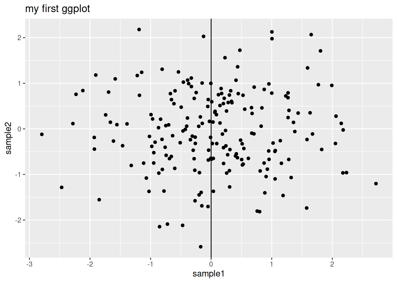
Bookmark this ggplot2 reference and the cheatsheet for some of the ggplot2 options.
- You can save the plot in an object at any time and add layers to that object:
# Save in an object
p <- ggplot(data= df1 , mapping=aes(x=sample1, y=sample2)) +
    geom_point()

# Show p: write p in the console and ENTER
p
# Add layers to that object
p + ggtitle(label="my first ggplot")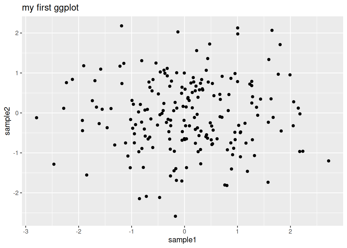
- What is inside the aes (aesthetics)function ?
- Anything that varies according to your data !
- Columns with values to be plotted.
- Columns with which you want to, for example, color the points.
- Anything that varies according to your data !
Color all points in red (not depending on the data):
ggplot(data=df1 , mapping=aes(x=sample1, y=sample2)) +
geom_point(color="red") 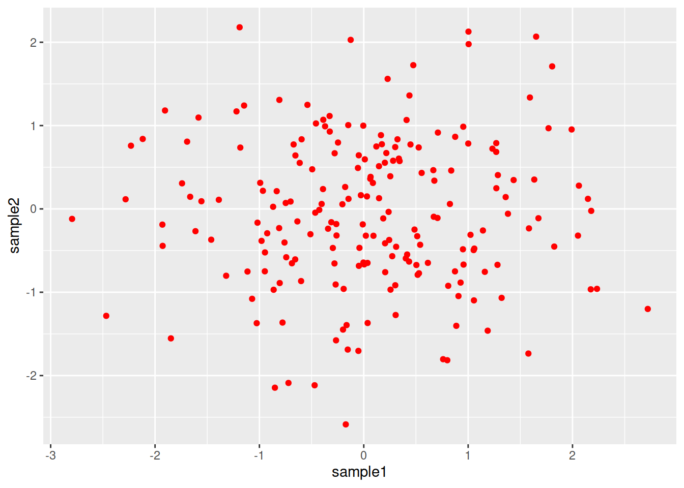
Color the points according to another column in the data frame:
# Build a new data frame df2 from df1:
  # add a column "grouping" containing "yes" and "no" values.
df2 <- data.frame(df1,
                  grouping=rep(c("yes", "no"), c(80, 120)))

# Plot and add the color parameter in the aes():
pscat <- ggplot(data=df2, mapping=aes(x=sample1, y=sample2, color=grouping)) +
  geom_point()
pscat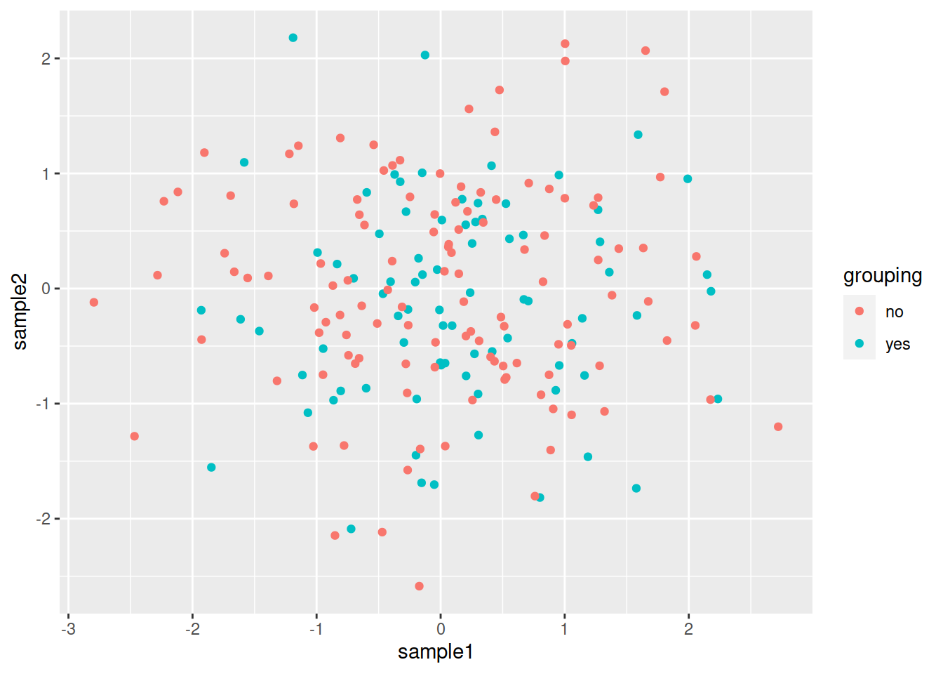
Note that the legend is automatically added to the plot!
HANDS-ON
We will now use the rock dataset from the datasets package. It contains the measurements on 48 rock samples from a petroleum reservoir.
- Create a scatter plot of area versus peri (perimeter).
- Color the points according to column perm of rock
- Create a horizontal line representing the median perimeter.
Answer
# Create a scatter plot of **area** versus **peri** (perimeter).
ggplot(data=rock, mapping=aes(x=area, y=peri)) + geom_point()

# Color the points according to column **perm** of **rock**
ggplot(data=rock, mapping=aes(x=area, y=peri, color=perm)) +
    geom_point()

# Create a horizontal line representing the **median perimeter**.
ggplot(data=rock, mapping=aes(x=area, y=peri, color=perm)) +
    geom_point() +
    geom_hline(yintercept=median(rock$peri))