16.5 Histograms
Simple histogram on one sample (using the df2 data frame):
ggplot(data=df1, mapping=aes(x=sample1)) + geom_histogram()## `stat_bin()` using `bins = 30`. Pick better value with `binwidth`.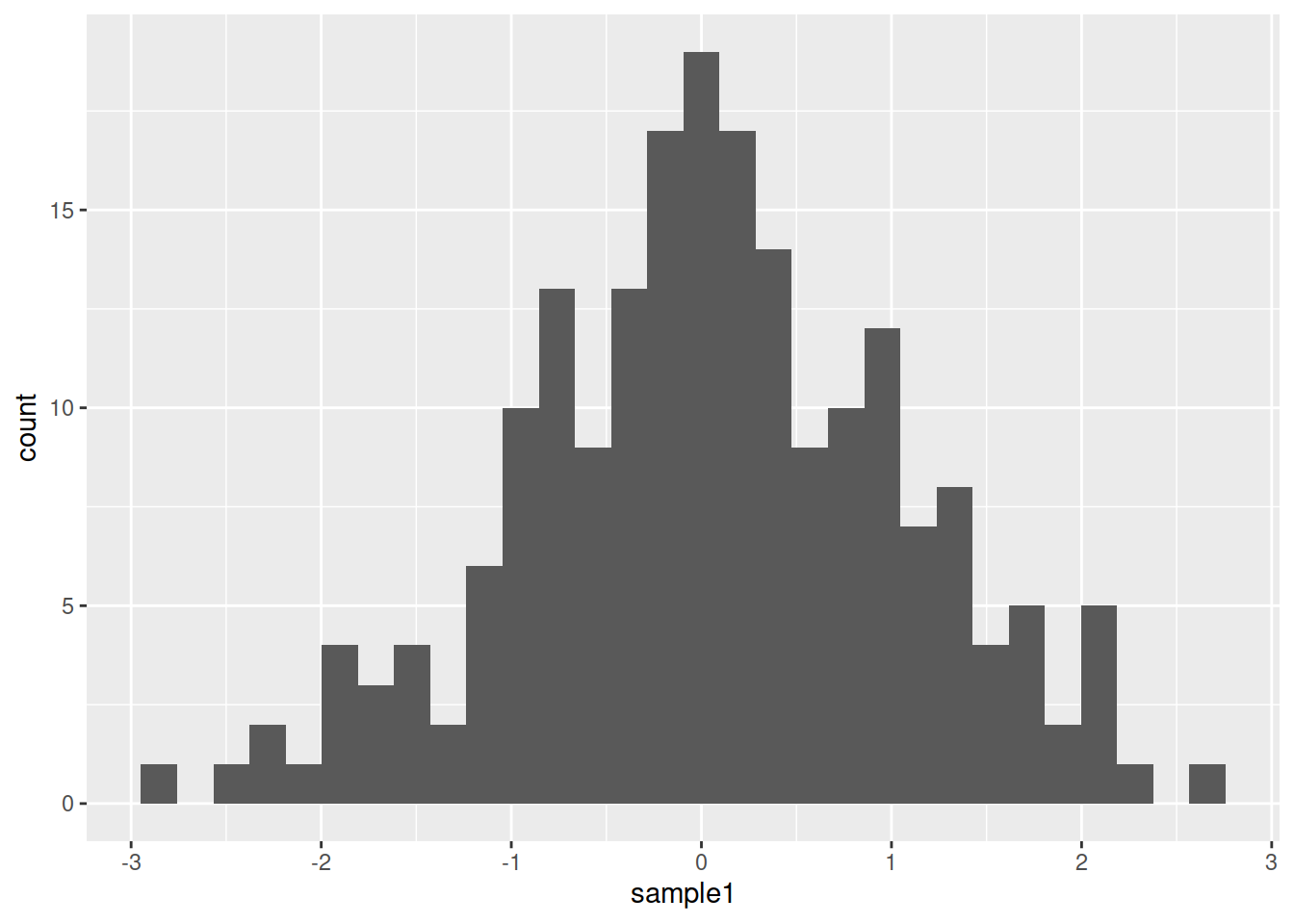
Histogram on more samples (using df_long):
ggplot(data=df_long, mapping=aes(x=value)) + geom_histogram()## `stat_bin()` using `bins = 30`. Pick better value with `binwidth`.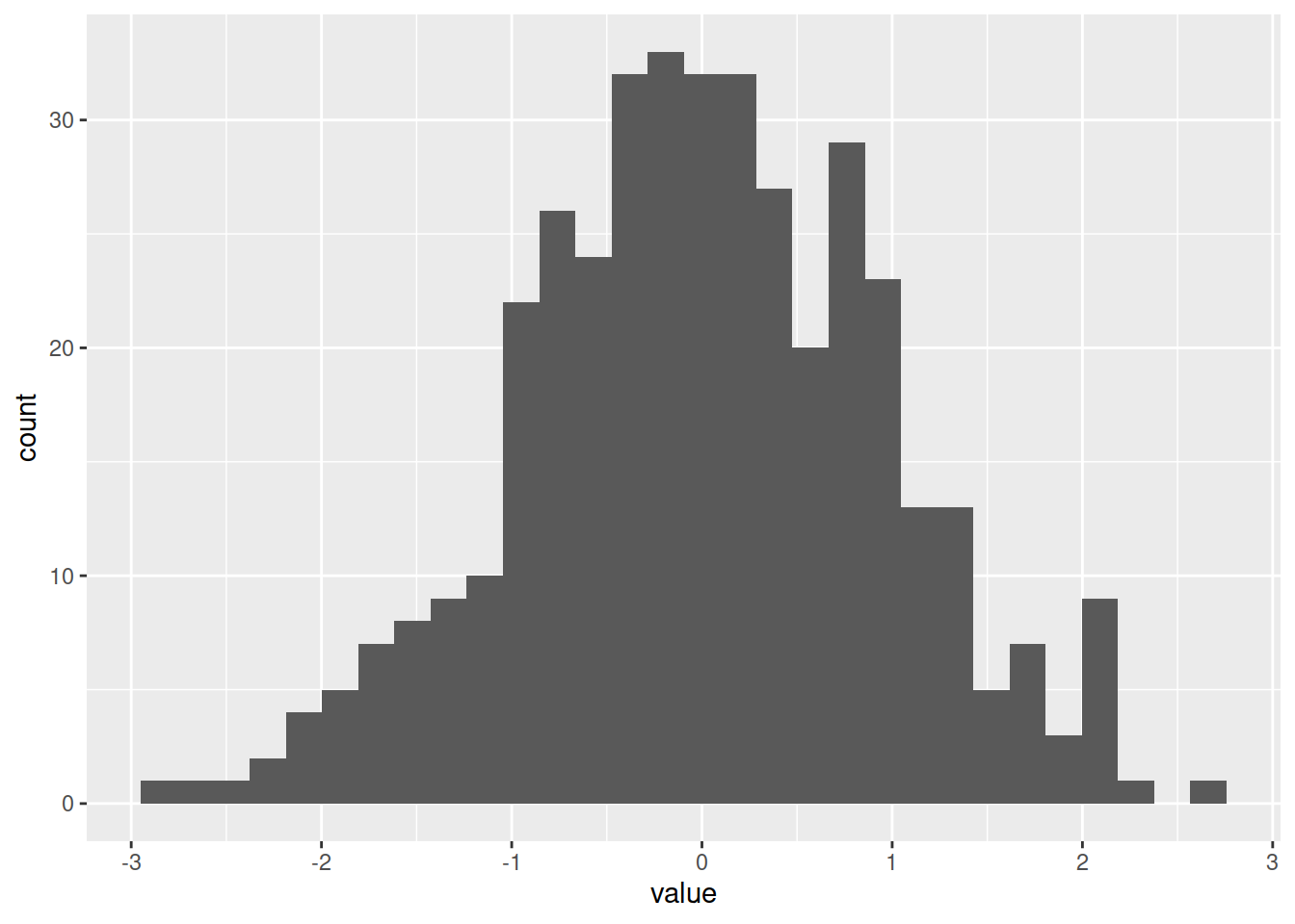
Split the data per sample (“variable” column that represents here the samples):
ggplot(data=df_long, mapping=aes(x=value, fill=variable)) + geom_histogram()## `stat_bin()` using `bins = 30`. Pick better value with `binwidth`.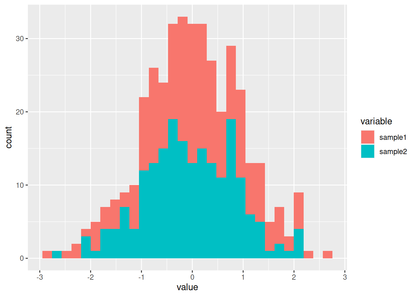
By default, the histograms are stacked: change to position dodge (side by side):
phist <- ggplot(data=df_long, mapping=aes(x=value, fill=variable)) +
    geom_histogram(position='dodge')
phist
## `stat_bin()` using `bins = 30`. Pick better value with `binwidth`.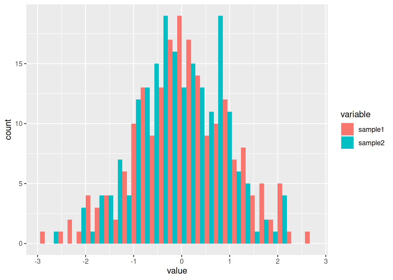
HANDS-ON
Going back to the rock dataset:
- Create a histogram of the rocks perimeter.
- Add a density plot to the histogram, following instructions from this post
Answer
# Create a histogram of the rocks **perimeter**.
ggplot(data=rock, mapping=aes(x=peri)) + geom_histogram()
# Add a density plot to the histogram
ggplot(data=rock, mapping=aes(x=peri)) +
    geom_histogram(aes(y=..density..)) +
    geom_density(alpha=.2, fill="lightblue")