16.3 Box plots
- Simple boxplot showing the data distribution of sample 1:
ggplot(data=df2, mapping=aes(x="", y=sample1)) + geom_boxplot()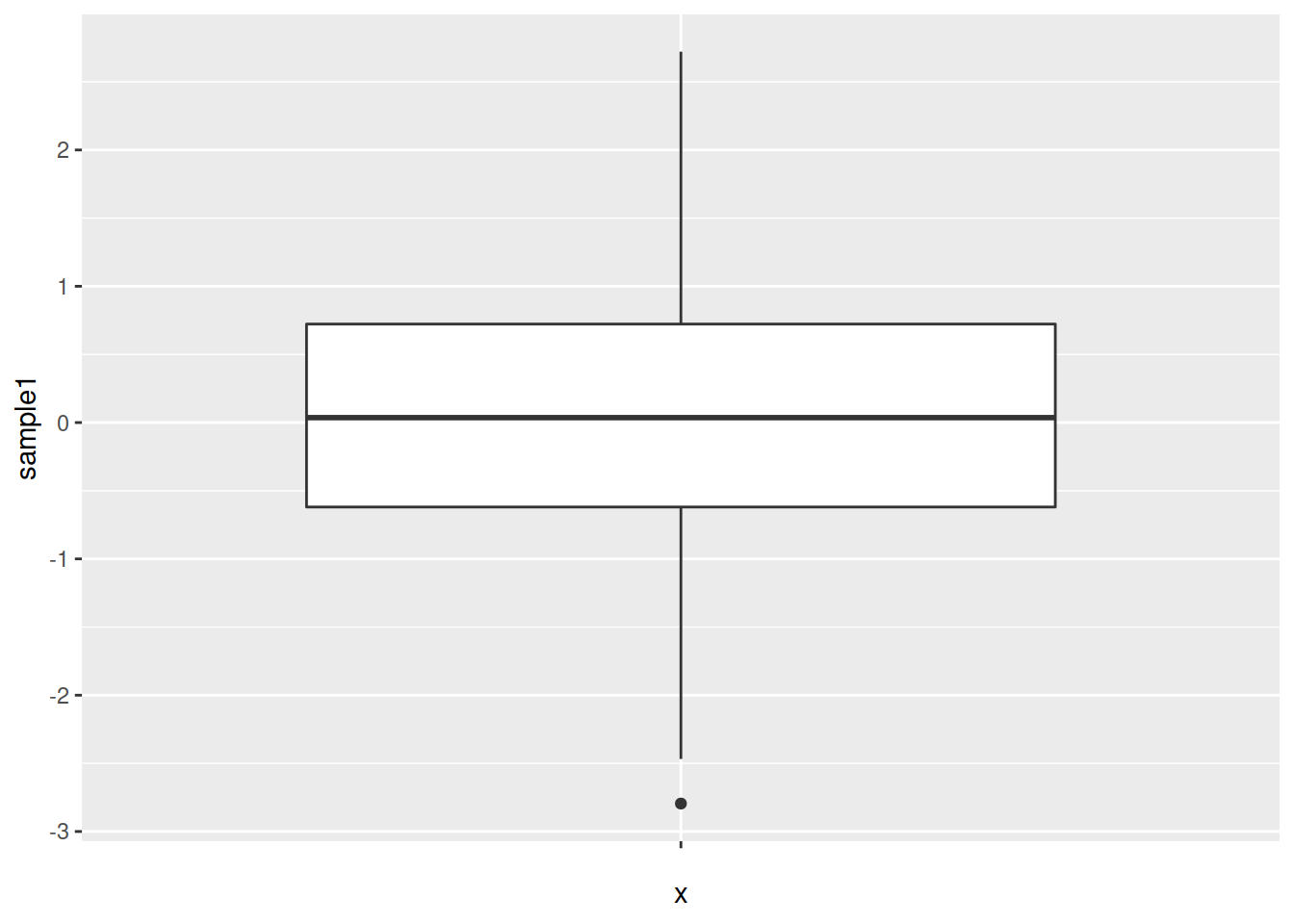
- Split the data into 2 boxes, depending on the grouping column:
ggplot(data=df2, mapping=aes(x=grouping, y=sample1)) + geom_boxplot()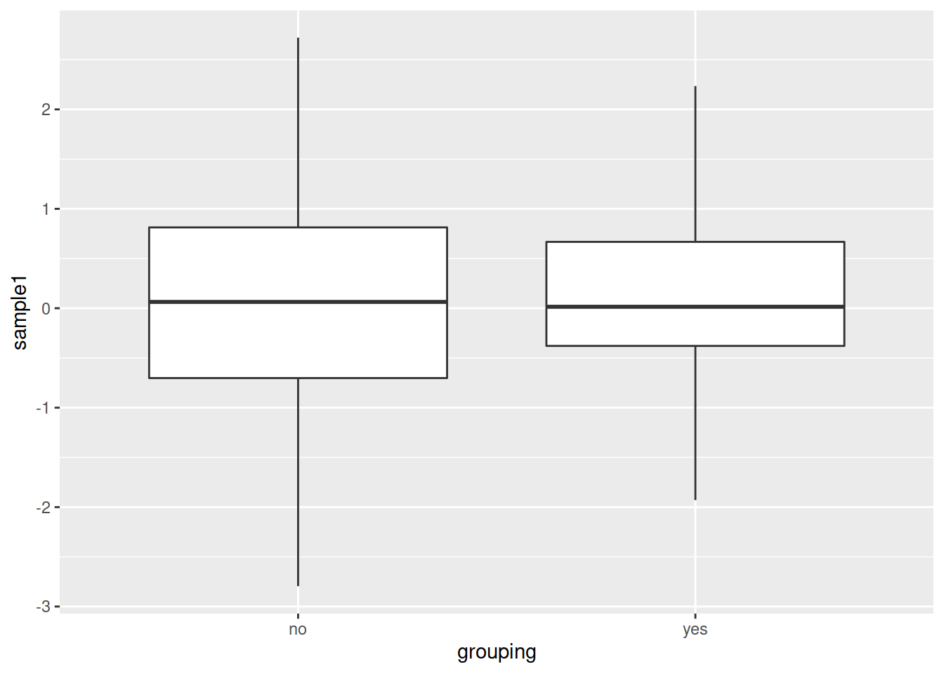
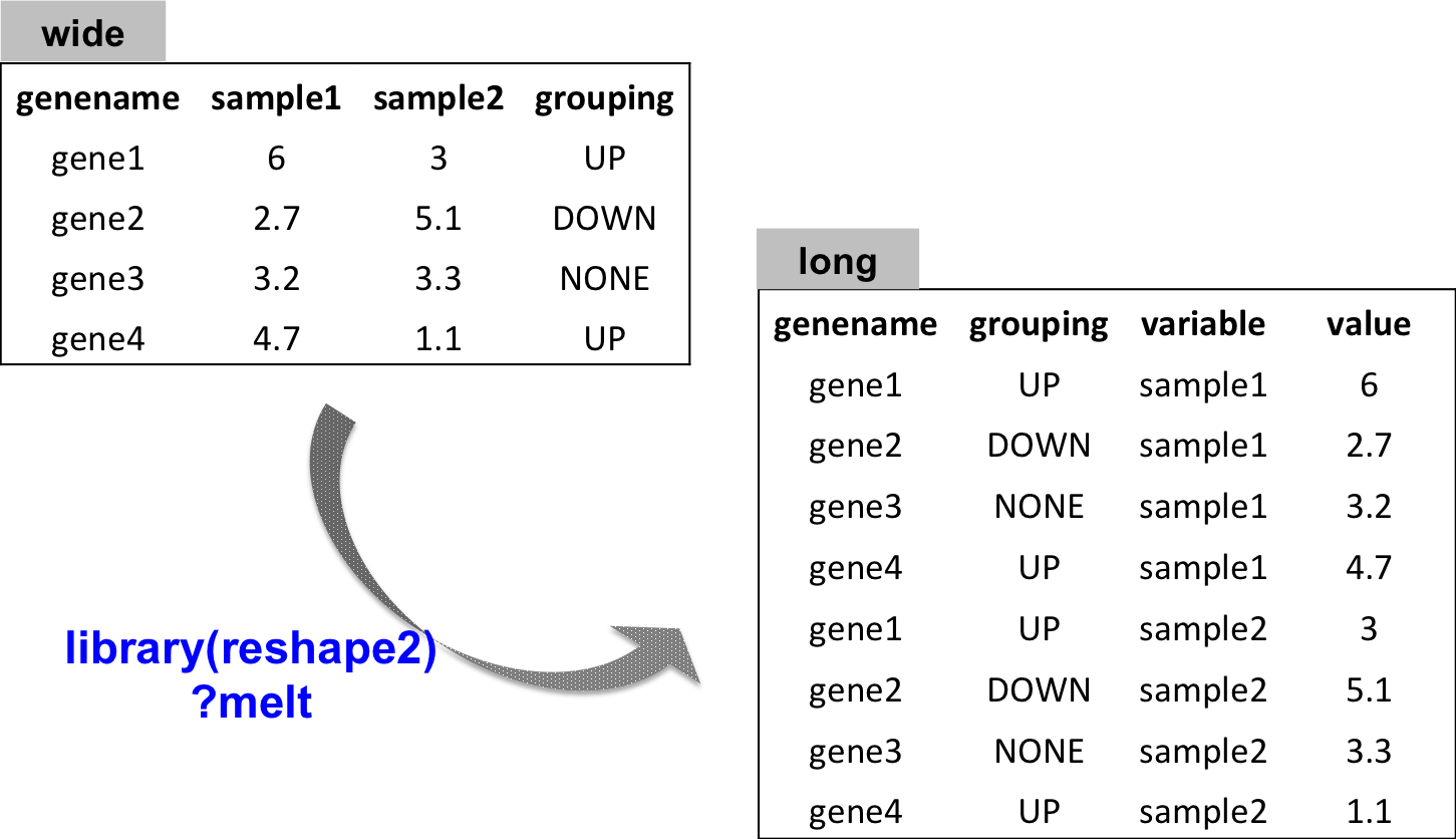
- What if you want to plot both sample1 and sample2 ?
You need to convert the data from a wide into a long format
What is the long format ?
One row per observation/value.
Plotting both sample1 and sample2:
# install package reshape2
install.packages("reshape2")
# load package
library("reshape2")
# convert to long format
df_long <- melt(data=df2)
# all numeric values are organized into only one column: value
# plot:
ggplot(data=df_long, mapping=aes(x=variable, y=value)) +
geom_boxplot()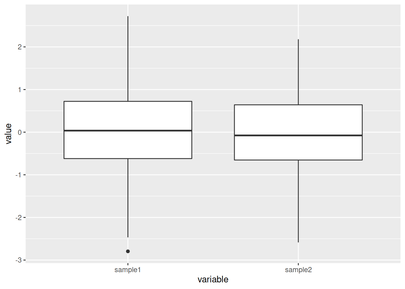
- What if now you also want to see the distribution of “yes” and “no” in both sample1 and sample2 ?
Integrate a parameter to the aes(): either color or fill.
# Either color (color of the box border)
ggplot(data=df_long, mapping=aes(x=variable, y=value, color=grouping)) +
  geom_boxplot()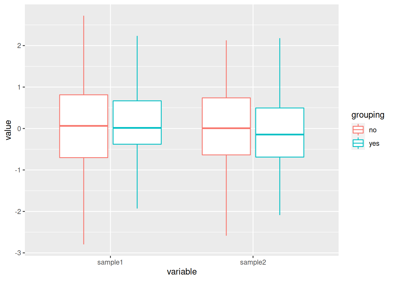
# Or fill (color inside the box)
ggplot(data=df_long, mapping=aes(x=variable, y=value, fill=grouping)) +
  geom_boxplot()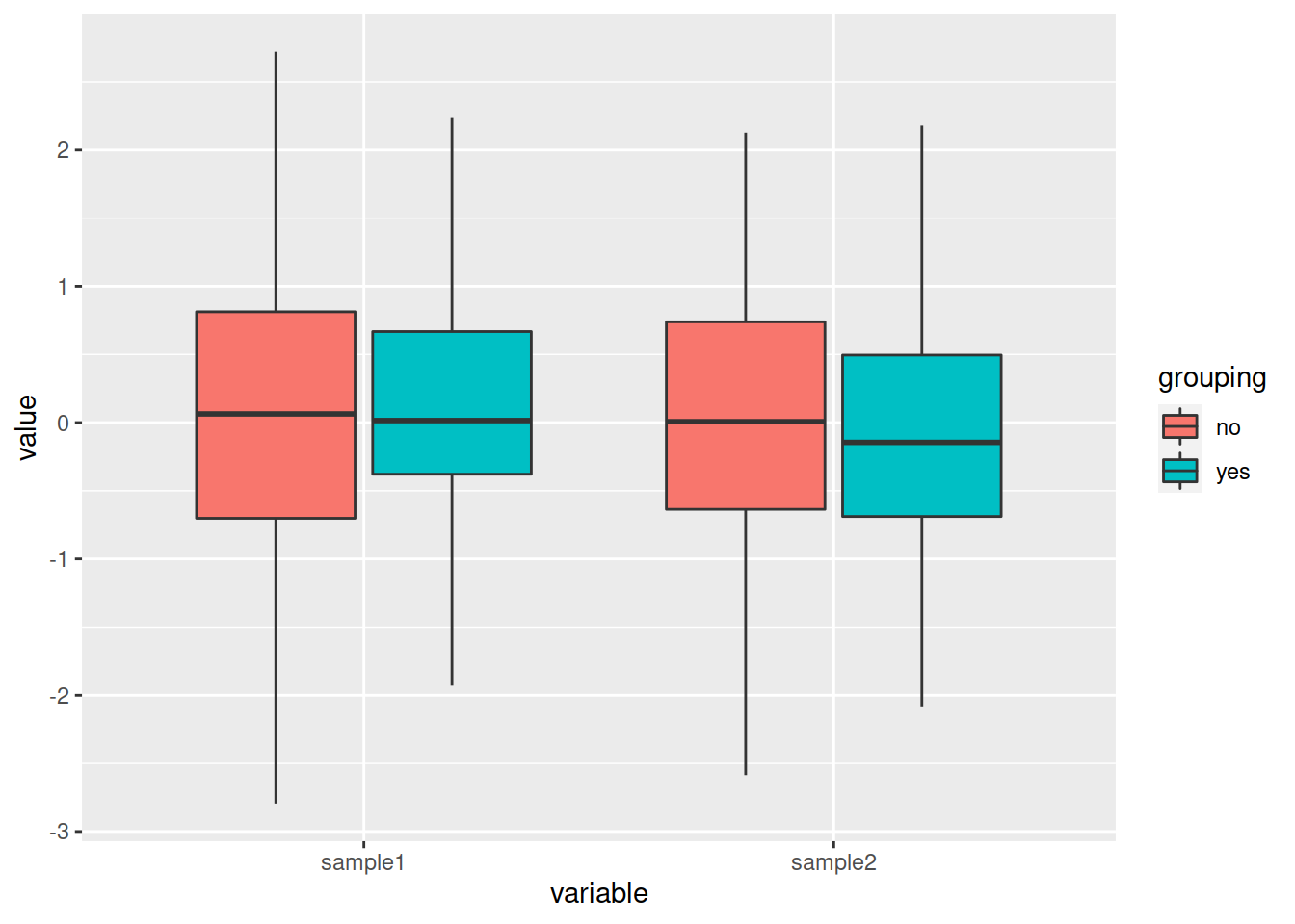
Do you want to change the default colors?
- Integrate either layer:
- scale_color_manual() for the boxes border color
- scale_fill_manual() for the boxes color (inside)
pbox_fill <- ggplot(data=df_long, mapping=aes(x=variable, y=value, fill=grouping)) +
    geom_boxplot() +
    scale_fill_manual(values=c("slateblue2", "chocolate"))

pbox_fill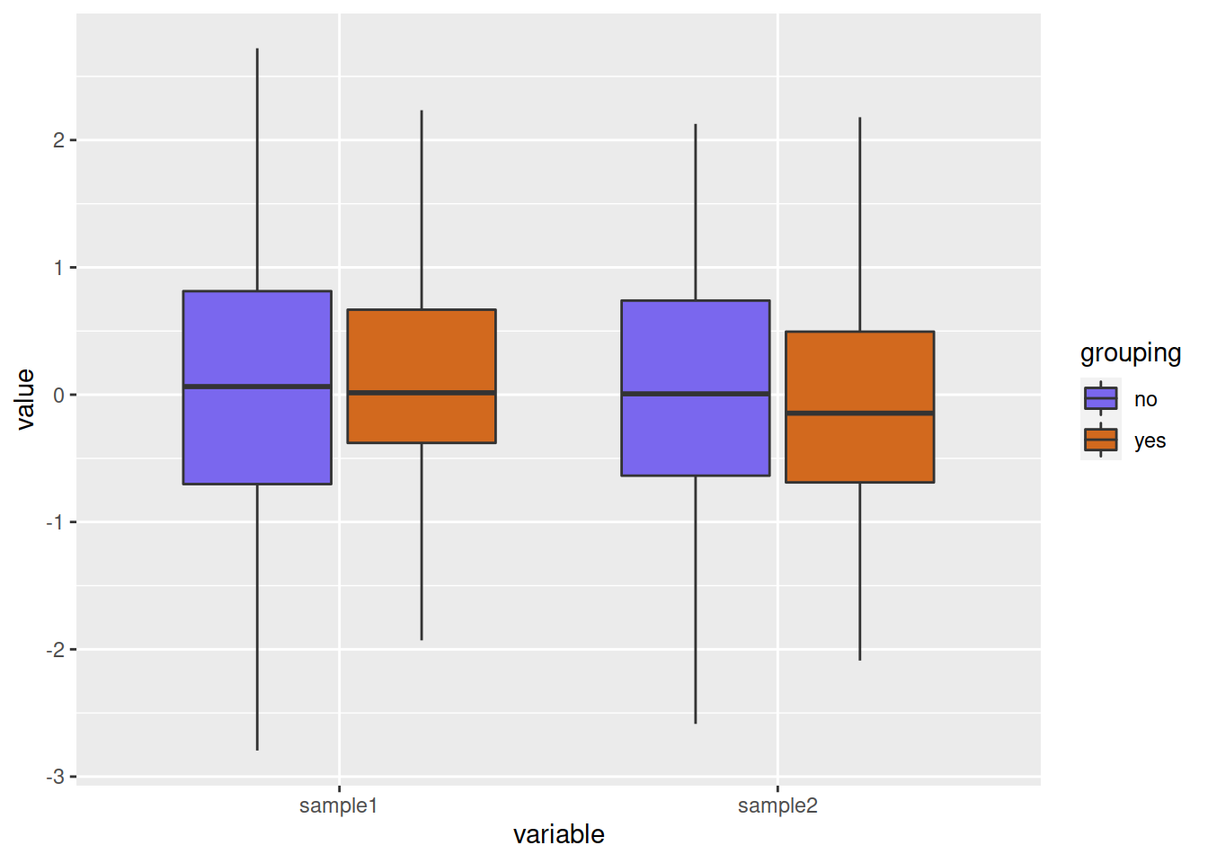
pbox_col <- ggplot(data=df_long, mapping=aes(x=variable, y=value, color=grouping)) +
        geom_boxplot() +
        scale_color_manual(values=c("slateblue2", "chocolate"))
pbox_col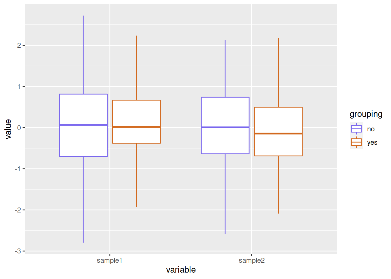
HANDS-ON
Let’s use the CO2 dataset that represents the carbon dioxide uptake in grass plants:
- Create a boxplot that represents the uptake for each Treatment.
- Split each boxplot per Type. Use either the color or the fill argument.
- Move the legend to the bottom of the plot. You can get help from this page
Answer
# Create a boxplot that represents the **uptake** for each **Treatment**.
ggplot(data=CO2, mapping=aes(x=Treatment, y=uptake)) + geom_boxplot()
# Split each boxplot per **Type**.
ggplot(data=CO2, mapping=aes(x=Treatment, y=uptake, fill=Type)) +
    geom_boxplot()
# Move the legend to the bottom of the plot.
ggplot(data=CO2, mapping=aes(x=Treatment, y=uptake, fill=Type)) +
    geom_boxplot() +
    theme(legend.position = "bottom")