15.1 pheatmap function from the pheatmap package
A heatmap is a graphical representation of data where the values are represented with colors.
The heatmap.2 function from the gplots package allows to produce highly customizable heatmaps.
# install pheatmap package
install.package("pheatmap")
Get started:
# load package
library(pheatmap)
# create matrix
mat <- matrix(rnorm(1200), ncol=6)
# heatmap with the defaults parameters
pheatmap(mat)
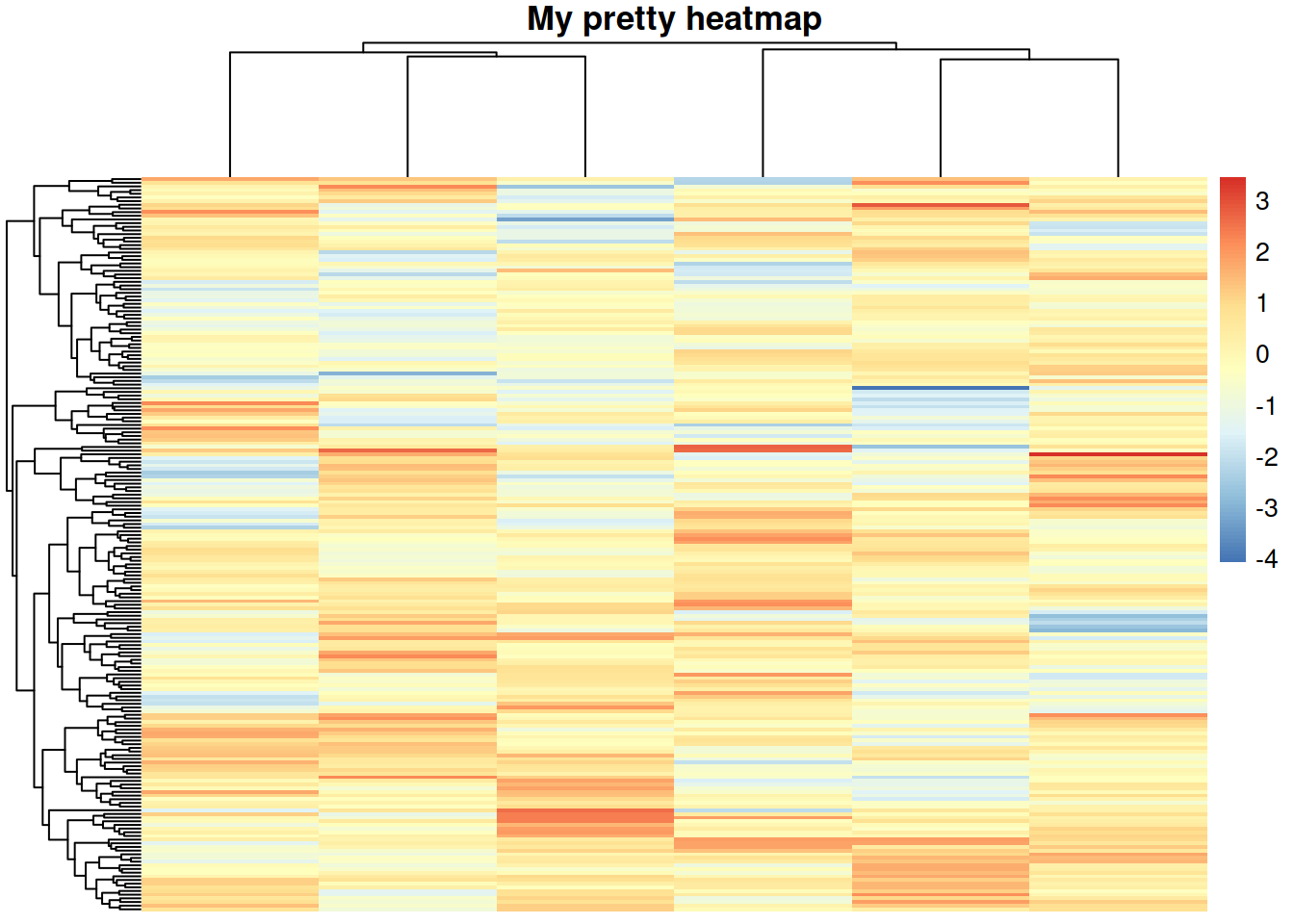
# add a title
pheatmap(mat, main="My pretty heatmap")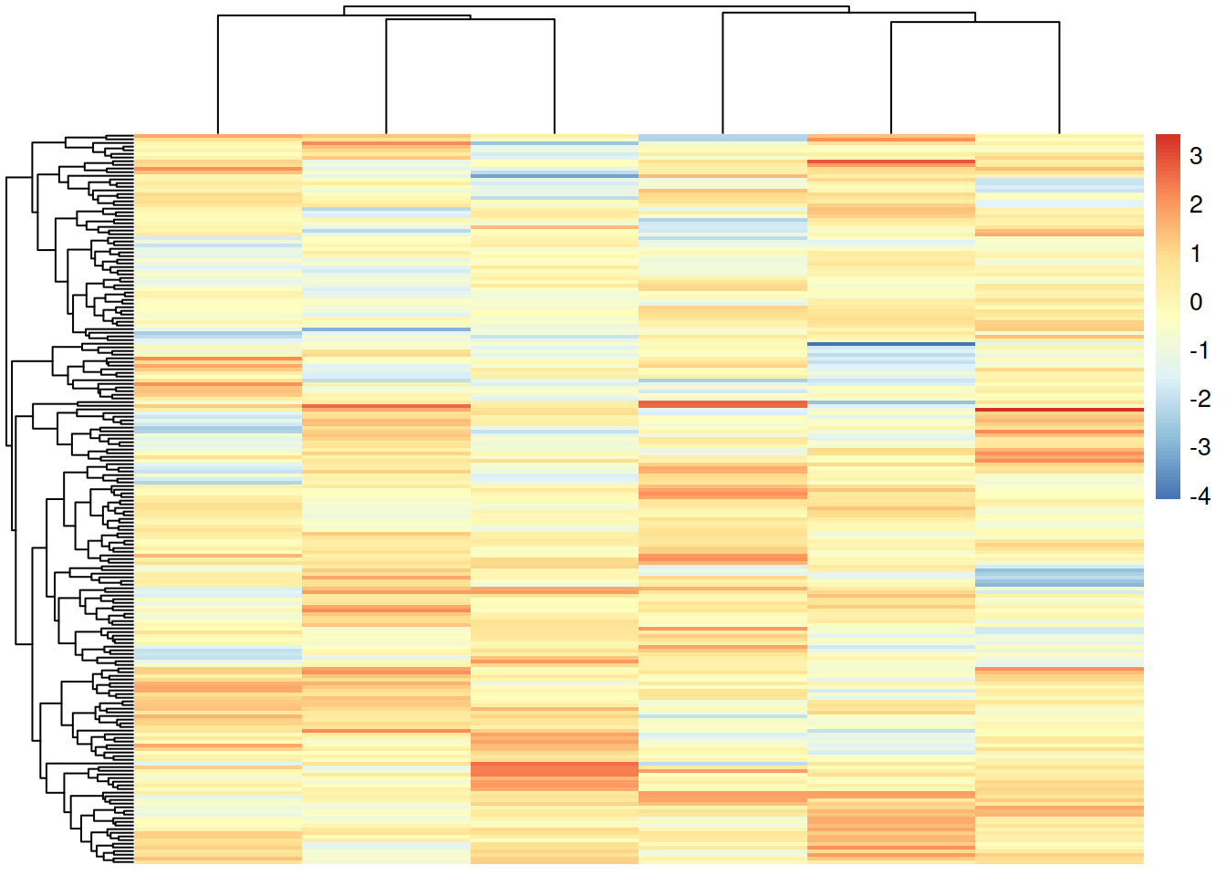
Change the color palette / gradient
# with "rainbow" colors
pheatmap(mat,
color=rainbow(50))
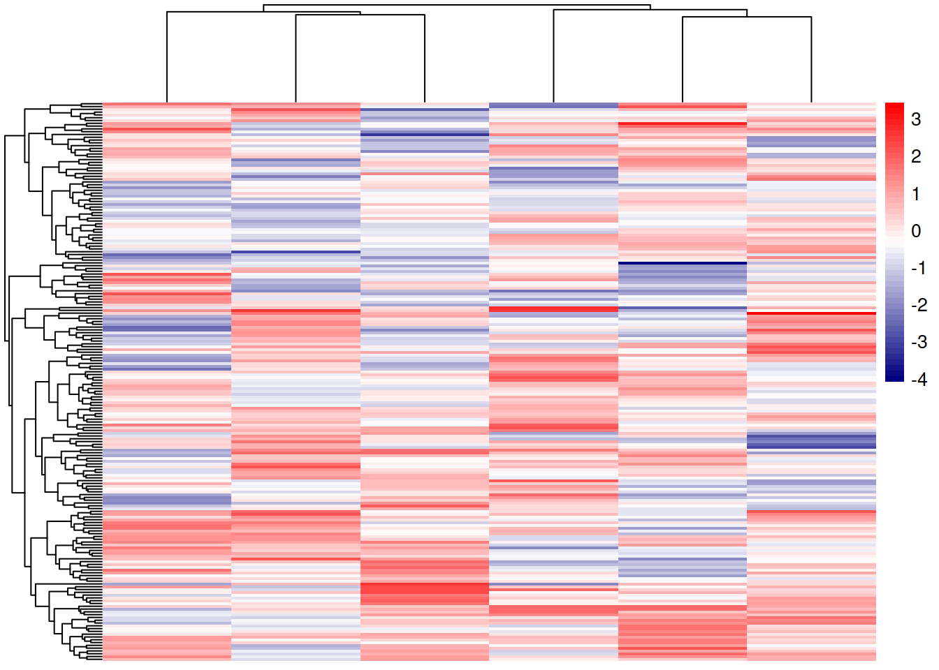
# with blue to red (middle color white)
pheatmap(mat,
color=colorRampPalette(c("navy", "white", "red"))(50))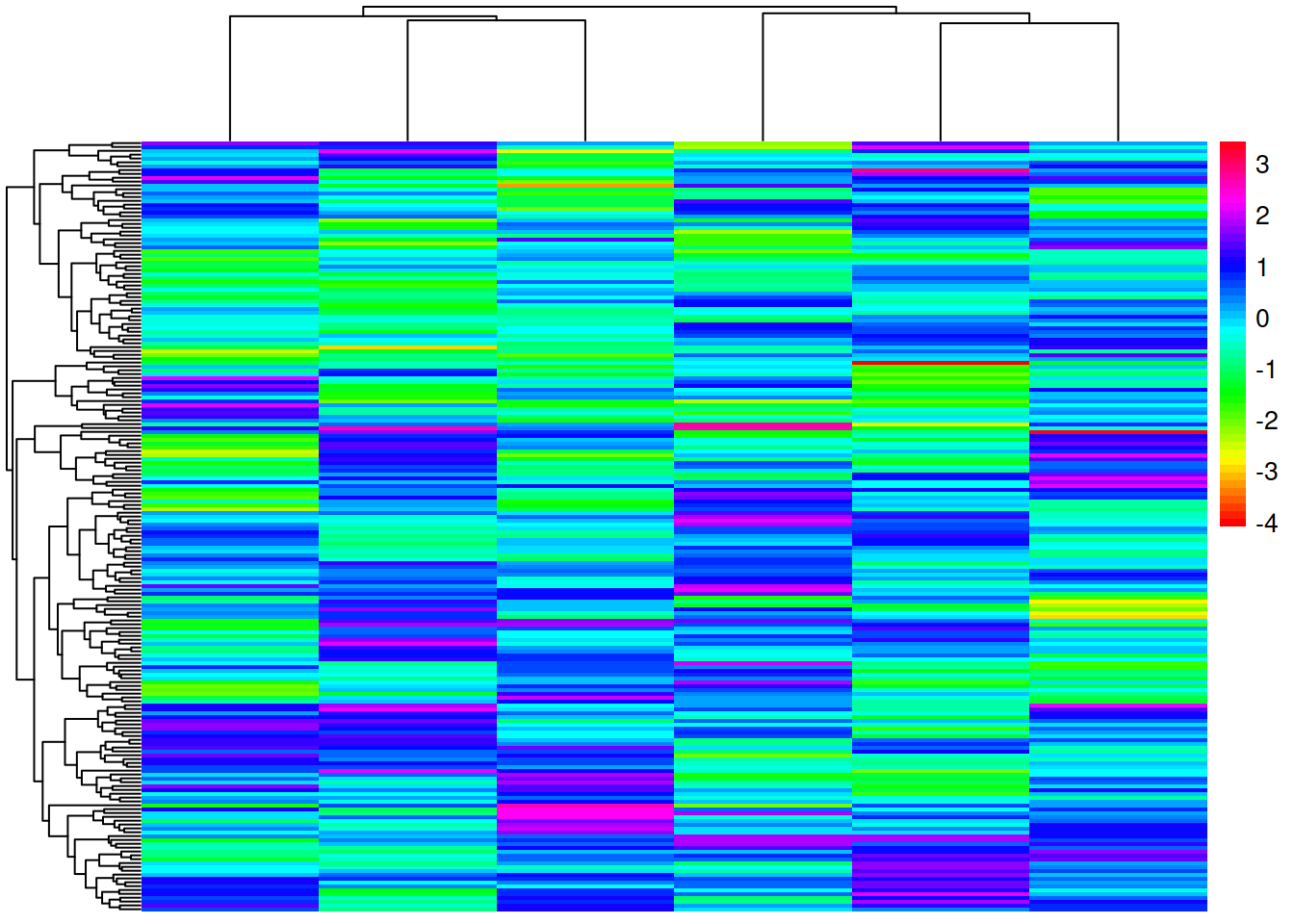
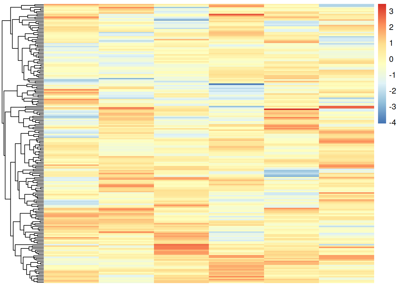
Do not cluster rows or columns
# remove the clustering by rows
pheatmap(mat,
         cluster_rows=FALSE)

# remove the clustering by columns
pheatmap(mat,
         cluster_cols=FALSE)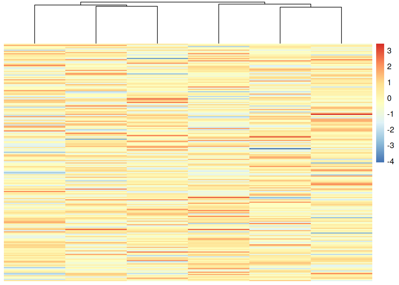
# remove both clusterings
pheatmap(mat,
         cluster_rows=FALSE,
         cluster_cols=FALSE)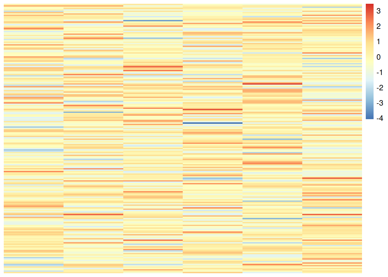
Add some annotation colored bar(s):
# add column names to mat
colnames(mat) <- paste0("Sample", 1:6)

# create data frame for annotation (in the case of samples, information about the experiment, for example)
annot_cols = data.frame(
                Group = c(rep("WT", 3), rep("KO", 3)),
                TimePoint = rep(c(0, 5, 10), each=2),
                    row.names = colnames(mat)
                )
# plot
pheatmap(mat,
         annotation_col = annot_cols)