13.4 Box plots
A boxplot is a convenient way to describe the distribution of the data.
- A simple boxplot:
# Create a matrix of 1000 random values from the normal distribution (4 columns, 250 rows)
mat1000 <- matrix(rnorm(1000),
                  ncol=4)

# Basic boxplot
boxplot(x=mat1000)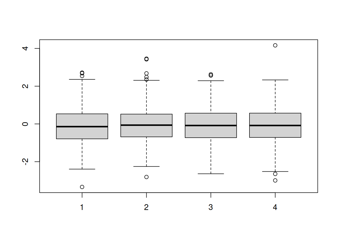
- Add some arguments :
- xlab: x-axis label
- ylab: y-axis label
- at: position of each box along the x-axis: here we skip position 3 to allow more space between boxes 1/2 and 3/4
boxplot(x=mat1000,
    xlab="sample",
    ylab="expression",
    at=c(1, 2, 4, 5))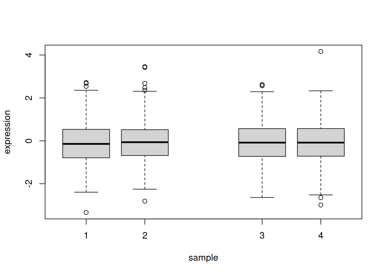
- Add an horizontal line at y=0 with abline(); arguments of abline :
- h : y-axis starting point of horizontal line (v for a vertical line)
- col : color
- lwd : line thickness
- lty : line type
NOTE: you can create a vertical line with abline(v=...) (v insteald of h)
# First plot the box plot as before:
boxplot(x=mat1000,
    xlab="sample",
    ylab="expression",
    at=c(1, 2, 4, 5),
     main="my boxplot")

# Then run the abline function
abline(h=0, col="red", lwd=3, lty="dotdash")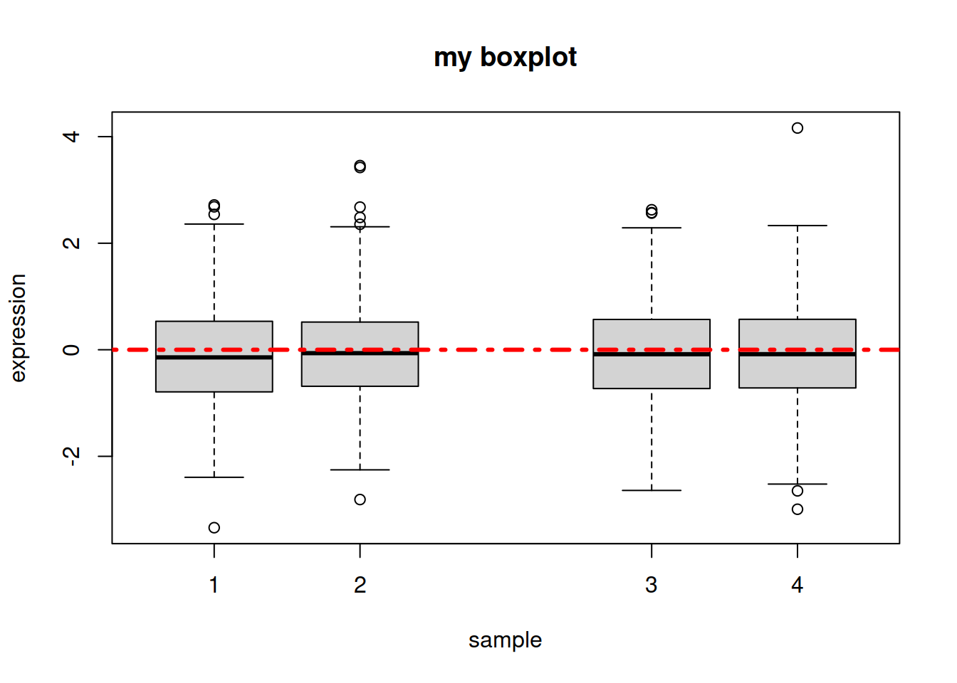
- Line types in R:

- We can also create a boxplot that plots a variable against another variable. For example, going back to our Loblolly data frame, we can create a boxplot of the height (y-axis) for each age (x-axis): one box per age group. Instead of setting parameter x we set parameter formula, as follows:
boxplot(formula=Loblolly$height ~ Loblolly$age)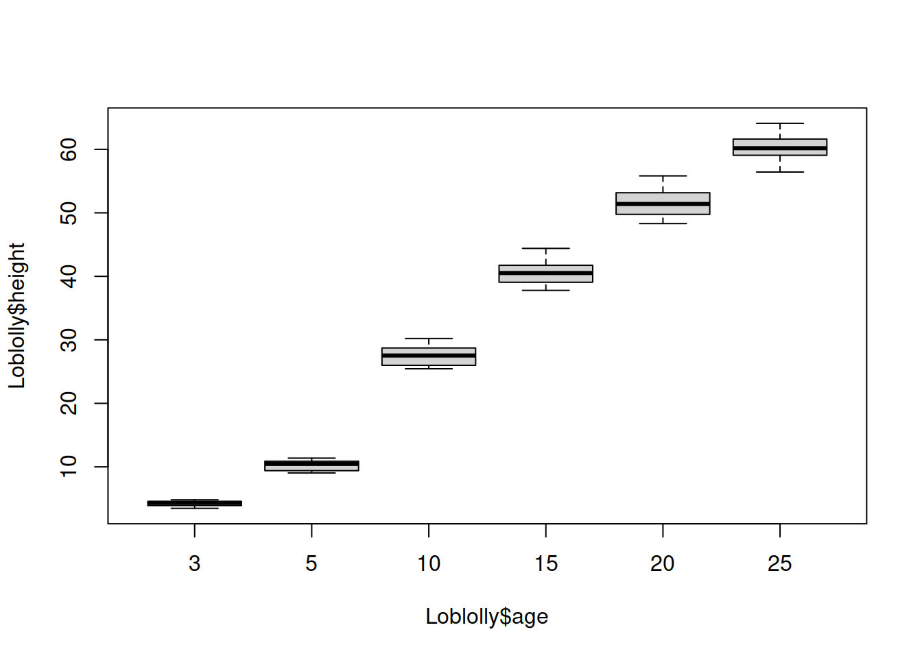
HANDS-ON
Let’s go back to our chickwts dataset:
- Create a boxplot that represents the chicken weight for each type of feed supplement.
- Create again the boxplot, but without the sunflower and casein types of feed supplement (you can create a new data frame called chickwts2).
- NOTE: you still see the groups you removed (while there is no data -> no boxes): this is because column
feedis made of factors. Factors retain the original levels (groups) even when no data is left for those groups. You can run:chickwts2$feed <- droplevels(chickwts2$feed)to “drop” the levels that do not have values left, and plot again.
- NOTE: you still see the groups you removed (while there is no data -> no boxes): this is because column
- Change the boxes’ colors.
- Add a legend on the top-left corner of the plot, and remove the x-axis labels.
Answer
# boxplot of weight / feed supplement
boxplot(chickwts$weight ~ chickwts$feed)
# remove sunflower and casein
chickwts2 <- chickwts[chickwts$feed != "sunflower" & chickwts$feed != "casein", ]
boxplot(chickwts2$weight ~ chickwts2$feed)
# drop "levels" from column "feed" containing factors
chickwts2$feed <- droplevels(chickwts2$feed)
# plot again after dropping the levels
boxplot(chickwts2$weight ~ chickwts2$feed)
# change colors: create a vector
boxcols <- c("lightgreen", "purple", "maroon", "lightblue")
# boxplot with colors (xaxt will remove the x-axis information)
boxplot(chickwts2$weight ~ chickwts2$feed,
  col=boxcols, xaxt="n")
# add a legend
legend("topleft",
        legend=names(table(chickwts2$feed)),
        fill=boxcols,
        )